Accentuating the Power of Shared Data

California Teacher Spiri Bavelas Trains her Students to Know Their Way Around Messy Data

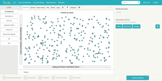
Working with data becomes second nature to students in Spiri Bavelas’ science classroom. Whenever they are completing an experiment in her class, students collect their own data and put it into a shared, class-wide spreadsheet. Then, Bavelas uploads the data into Tuva where students can manipulate and explore it. When Bavelas uses larger, messy datasets, she’s drawing from her years as a research assistant before she began teaching.

“You never are going to look at just five numbers in the real science world.”

“When I started, students collected four or five numbers and were supposed to come up with a big conclusion, but you never are going to look at just five numbers in the real science world,” she said. 

Bavelas has worked in a handful of different schools throughout California, but recently took a position at R. Roger Rowe Middle School in Rancho Santa Fe. Wherever she has been, Bavelas has engaged her students with large data sets. 

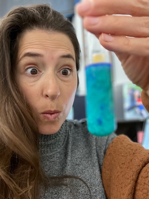
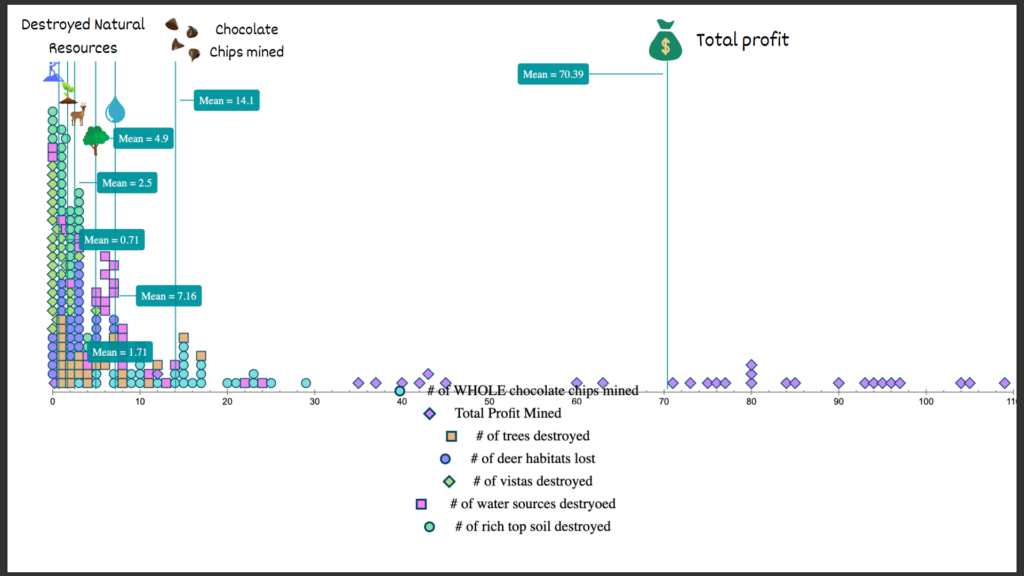
One of the lessons she hopes to impart to her students is that people can use data to make better decisions. Bavelas used a popular mining simulation to illustrate this concept during an environmental resources unit. Students placed cookies on grid paper and mined the chocolate chips, keeping track of expenses and income. Afterward, she instructed them to measure damage to the environment based on the number of grid squares where crumbs landed. By analyzing all of the data pooled from Bavelas’ classes, students gained insights into which mining strategies caused minimal harm, enabling them to develop new, environmentally-friendly, yet still profitable, methods of extraction.

Bavelas’ students use Tuva to generate graphs that include data from all of their classmates.

Bavelas also showcased the utility of collective data during an annual egg drop competition at one of her former schools. Engineering teams were awarded points for landing crafts that had a slow descent, hit the target, and kept the egg safe. Bavelas had been collecting egg drop data over multiple years. Students used the data from prior years to inform their design decisions. For example, the data revealed that a light lander is advantageous, but only up to a point. If the device is too light, it drifts off target.

“Data analysis is not just something you can do in one class,” Bavelas said. “Data can be a thing on a larger scale where you can collaborate with people that are not right next to you.”

Bavelas also wants her students to be aware that data displays can be manipulated to suggest certain conclusions. For example, she explained, if you look at a bar graph and zoom in on the differences it might look like the more massive car travels down a ramp faster. However, when you look at it on a larger scale, the difference is tiny, and calculations reveal there is no statistical correlation between mass and speed.

Whether it’s understanding the importance of sample size, utilizing data to make good choices, or being savvy enough to detect deceit, Bavelas hopes the lessons students learn in her science class will serve them well in whatever path they choose.

“I want the skills students obtain in science class to be a vehicle for better understanding and functioning in the entire world.”

Starting the Year with Data Literacy

Science Teacher Margo Murphy Does Science From Day One

When most people think “back to school,” it conjures images of students seated at a desk, their heads bent over their computers and papers. In Margo Murphy’s Earth Systems Science classroom, though, “back to school” has a different meaning.  Murphy jumps right into doing science. That means the first days back find her students outside in their Rockport, Maine schoolyard collecting data.

At first, the content of the investigation doesn’t matter; what matters is if observational data can be gathered to answer the question. Each group picks a question that sparks their interest.  For logistical purposes, Murphy limits them questions they can answer on campus. For example, one group of students might be measuring the length of white pine needles to see how variable they are while another is documenting the brands, models and colors of vehicles in the school parking lot. The purpose?

“It gives kids the idea that you can have highly variable data but still see trends,” Murphy explained. This is fundamental in her Earth Systems course, she elaborated. “You are going to have messy data if you are going to work in the earth sciences.” Murphy and her Earth Systems colleagues at Camden Hills Regional High School consider data literacy so essential to the earth sciences that they devote a significant portion of the first quarter helping their students master it. 

They don’t have to focus on getting it ‘right’ the first time, so they can iterate.”

Once students have collected data, they upload their data on Tuva and begin to explore it. Murphy’s students always enjoy the “playground aspect” of Tuva, being able to bring data in and look at it in a variety of ways. To capitalize on this engagement, Murphy builds in time for her students to “play”. 

“[With Tuva] they don’t have to focus on getting it ‘right’ the first time, so they can iterate,” Murphy said. 

Murphy scaffolds learning using Tuva’s graph choice chart.

As students are becoming conversant with analyzing complex data, Murphy scaffolds the learning process using Tuva resources like the graph choice chart

The time and energy devoted to data literacy pays dividends later in her course as students grapple with complex earth systems core ideas such as weather and climate, topics which Murphy considers vitally important.    

Two scatter plot graphs showing a strong correlation between CFC levels and ozone hole area.
Murphy introduces data skills early, preparing students to apply them to projects like this one later in the course.

“I want kids to understand that there is change on the planet, that this change is rapid, and how they can find evidence and understand that evidence to understand these changes and ask good questions.”

Explorar datos en Tuva

Tuva’s dynamic, easy-to-use data exploration and visualization tools are now available in Spanish.

Today, we are excited to take our first few steps in bringing Tuva’s Data Literacy Solutions to schools, higher education institutions, businesses, and sustainable development organizations globally. 

Our dynamic, easy-to-use data exploration and visualization tools are now available in Spanish, enabling Spanish-speaking learners around the world build a strong foundation in data and statistical literacy.

You can find our Spanish language datasets on our Tuva Datasets Library.  

Once you choose your Spanish-language dataset, you will find that all the dataset attributes, as well as all the features and functions on the toolbar are labeled in Spanish. 

Over the next couple of weeks, we will make Tuva’s data exploration and visualization tools available in other languages, so please stay tuned for further updates and announcements. 

For now, vamos a aprender datos sobre Tuva!

Graph Choice Chart

This blog post is written by Molly Schauffler. Dr. Schauffler is an Assistant Research Professor at the University of Maine School of Earth and Climate Sciences.

So, your students have some data. Now what?

One teaching challenge is how to guide students to apply math skills when they “analyze and interpret” data in the context of learning content in other subjects – science, or history, or social science. 

Many educators see students stumbling to apply basic data literacy skills such as organizing data, graphing, fitting lines and thinking statistically in general, when working outside of math class with real (often “messy”) data about the real world.

In our work in the Maine Data Literacy Project over the last six years, we observed, over and over again, three glaring weak spots in students’ data literacy:

  1. Lack of a clearly-stated driving question or claim to investigate
  2. Overwhelming tendency to plot data in bar graphs as a default graph choice.
  3. Absence of discussion about variability in data.

We wondered: how could we help students frame clear, statistical questions to drive their inquiry? How could we help them make reasoned decisions about how to visualize data as evidence? How could we help them begin to see, describe, and make sense of variability in data?

And so, the Graph Choice Chart was born. The Graph Choice Chart (GCC) proposes five types of questions that students are likely to investigate:

  1. Questions about variability within a group
  2. Questions about comparing groups
  3. Questions about Correlations
  4. Questions about change through time (a special kind of correlation)
  5. Questions about how a group is proportioned into sub-groups.
image

                                       Screenshot of the Graph Choice Chart 

Students are prompted to clearly state (write out!) a complete question in one of these forms, and then to follow a decision tree for choosing – based on the nature of their question –  what kind graph would make sense to use for developing their evidence.  

In addition to helping students clarify the purpose of their analysis, the GCC maps a framework for building statistical thinking and language, informally at first.  

Students make deliberate decisions within the framework about what kind of question to ask, what kind of data are needed (categorical or quantitative), and what kind of graph makes sense for visualizing evidence. 

It prompts them to adopt language for visualizing and describing variability in data, an underpinning of reasoning about data. Once they master these skills, they are ready to move beyond the GCC to more complex kinds of questions and more quantitative analyses.

Tuva is a perfect environment for putting the Graph Choice Chart to work, whether students are collecting their own data, or working with Tuva Datasets

In future blogs, we’ll talk more about how early informal focus on variability supports the Common Core Math Standards and is a key underpinning to data literacy.

Download the Graph Choice Chart by logging into your Tuva Dashboard or the Tuva Resources section, and share it with your students and colleagues today. 

Introducing Data Literacy 101 course on Tuva

This blog post is written by Molly Schauffler. Dr. Schauffler is an Assistant Research Professor at the University of Maine School of Earth and Climate Sciences. 

Raise your hand if the idea of teaching your students data analysis and statistical thinking is a little unsettling for you.

For many of us who teach social studies, history, language arts, and (yes) even science, it has been a very long time since we took a course in statistics. For many, statistics is a scary label.

Even fewer of us have ever had training in how to incorporate statistical thinking into curriculum for young students. Yet assessments and standards expect our students to analyze and interpret data and make compelling arguments from evidence. Yikes.

The good news is that statistics educators and education researchers, and Tuva, promote an initial exploratory approach to learning how to think statistically about data. Research finds that students have lots to say about data once they have tools, opportunity, and guidance to explore data informally and reason about the stories they find.

Quantitative, or “Confirmatory” statistical analysis comes later, once students grasp challenges of making informal inferences about groups and attributes that are variable. 

In Exploratory Data Analysis, students first learn to recognize and talk about variability, and how variability and certainty are related. They learn to explore data, make informal claims, and develop language for describing their data.

If you feel hesitant about guiding students in data analysis, you are not alone. Many of you have asked for some kind of “orientation” for students starting out with data on Tuva. 

Today, we are excited to launch Data Literacy 101, a course with modules and lessons designed to establish fundamental exploratory data analysis skills (“Level I”).  

image

In the coming weeks, we will add lessons that scaffold students in more quantitative analyses (“Level II”), that then launch them into a grounded and integrated approach to analyzing data as evidence (“Level III”).

Data Literacy 101 lessons incorporate pre- and post-assessment questions to help identify gaps and gains in learning. Lessons are tagged to identify relevant data literacy standards. Follow-on activities will give students practice in skills just learned in a lesson using datasets tagged by content area. 

In addition to building students’ skills, Data Literacy 101 is a useful reference if you want to refresh your own familiarity with basic statistical concepts and tools and language.  

Data Literacy 101 can help you and your students experience the fun of playing with data and telling the stories they find. Let’s get started!