HS Junior Melds Stats With Civics to Gain Insights into Infant Mortality

View from the Classroom

Data Crosses Disciplines, Yields Powerful Learning

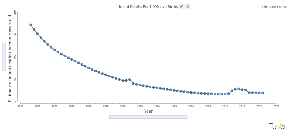
Up until the mid-1800s, children had a 50% chance of dying before age 15. By 1950 the childhood mortality rate was closer to 25%. Today, it sits at 4.3% globally. Childhood mortality rates have experienced a steep, steady decline across the world.

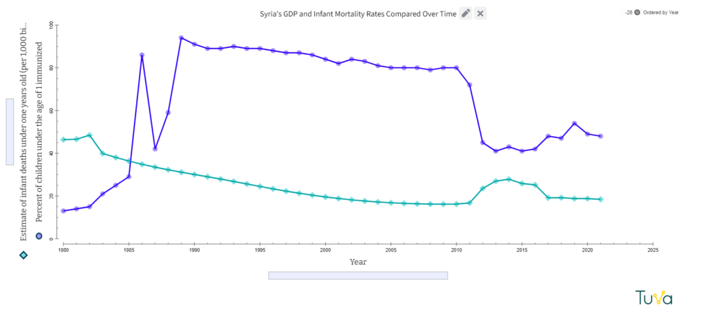
So, when Kate Harrison, a high school junior in Charlotte, North Carolina, was sifting through data about infant mortality rates in different countries, Syria’s data gave her pause.

“Syria in particular has these two spikes, and I got really interested, thinking, what was happening at the time?” she said.

Thus was born a semester-long investigation.

Data Transcends Disciplinary Boundaries, Deepens Learning

Harrison was enrolled in an honors statistics class at Fusion Academy where she’d been charged with undertaking an interdisciplinary project. She’d decided to apply statistics to explore history, but identifying a focus took time.

Her original idea was a bit nebulous, but it centered around trends in warfare over time. To clarify her question, she began exploring data. In the process, she stumbled upon the Syrian infant mortality data. That’s when nuanced and intriguing questions pushed their way to the forefront.

Harrison immediately noted an association between the timing of armed conflicts in Syria and the spikes in infant deaths. She noticed that after the start of the Islamist uprising in Syria in 1981, infant mortality increased by 4.24%. The nation suffered an even more drastic 52.7% increase in the infant mortality rate from 2010-2014 at the beginning of the Syrian Civil War.

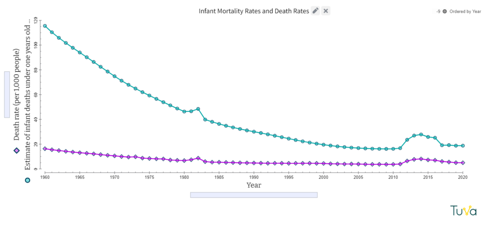
Harrison discovered that in both instances there had been a concurrent rise in overall mortality. However, she knew that infants didn’t fight in the wars, so what were the underlying connections? Harris worked with her faculty advisors, social studies teacher Rick Fera and statistics teacher Chad Boger, to brainstorm variables that may have influenced infant mortality. 

Variables she explored included birth rates, governmental regimes, international aid, gross domestic product, basic sanitation, basic healthcare access, and vaccination rates.  She compiled data about these factors from Our World in Data and the World Health Organization and imported it into Tuva for analysis. Harrison said identifying changes and interpreting patterns was easier for her when she used Tuva.

“You really just can’t tell using a table because there’s so many numbers and so many different data points,” she said. “And so getting to put that all into one tool and really visualize it without having to go through the hassle of actually plotting out each point, and probably doing something wrong, was very helpful.”

Surprises in the Data

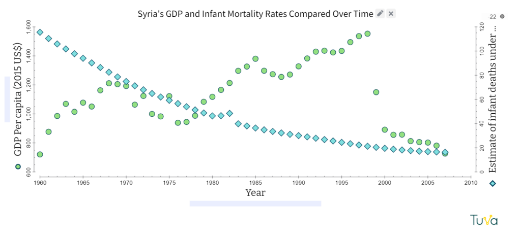
In some cases, Harrison was surprised at the lack of correlation between variables. She had assumed, for example, that GDP would have a large impact on infant mortality rates, but the data did not show a correlation. In fact, Syria experienced a financial crisis a few years before the civil war, but the infant death rate did not experience a resultant increase.

What did show a correlation with infant mortality – vaccination rates. In the early 1980s, Syria engaged in a national immunization campaign, and infant mortality rates showed a steep decline. However, when immunization rates faltered during the civil war and uprising, infant mortality spiked again. 

Using Data to Inform Priorities in War-Torn Nations

“This data suggests that immunization programs and keeping healthcare systems intact should be a high priority in war-torn nations,” Harrison concluded. “Several relief programs are focusing on integrated management of childhood illnesses, which includes improving case management strategies of healthcare providers, healthcare systems, and families.” 

Boger, Harrison’s teacher, applauded her work, saying she’d exceeded his high expectations. This spring, Harrison will have another chance to explore her passions with a civics math class she’s enrolled in.

“I personally see data as the backbone of any social change.”

She is also beginning to think about life after high school. She’s begun exploring four-year colleges and aspires to pursue degrees in political and environmental sciences. 

“I personally see data as the backbone of any social change,” said Harrison. “Being able to visualize and look at data clearly is essential to taking meaningful action and maximizing your impact. I see this, especially with environmental justice and climate change. Data will help determine which areas are most in need of relief and which areas will face the most impact. I hope to be able to focus on data-driven environmental policy work in the future.”  

Inspired? Explore Data You’re Passionate About
  1. Find data that sparks your curiosity.
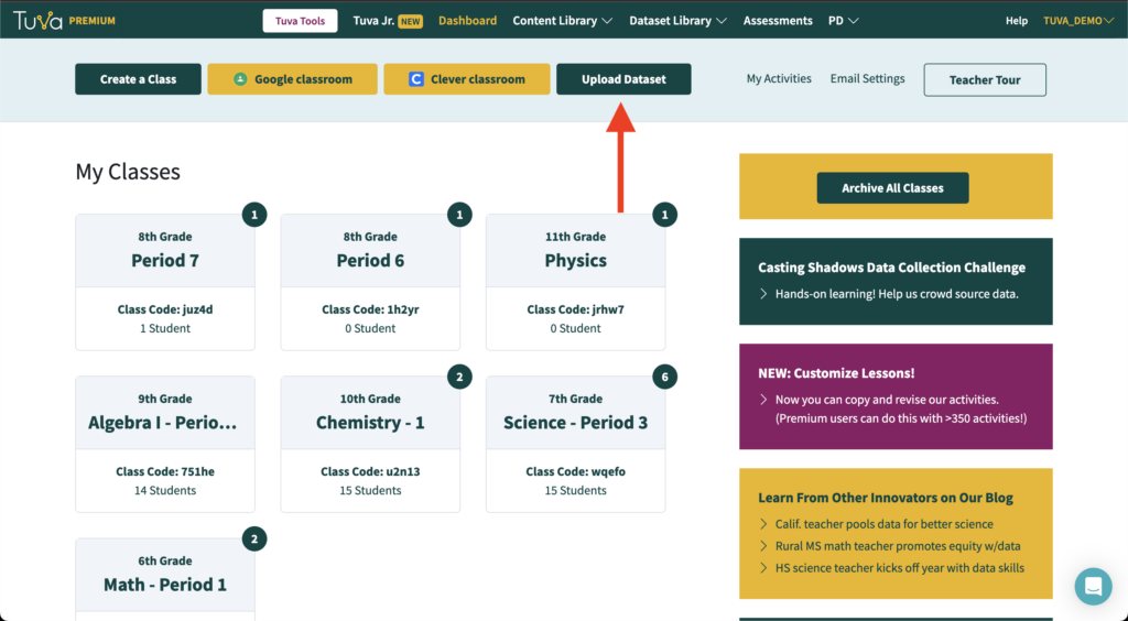
  2. Click “Upload Dataset” from your Tuva dashboard or type tuvalabs.com/upload in your web browser’s URL bar.

3. You may now import a dataset from your computer, Google Drive, or One Drive, or by dragging and dropping your CSV, XLS, or XLSX file into the gray rectangle.

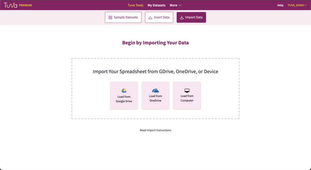
4. You’ll be prompted to review your data. Afterward, you’ll be taken to a visualization screen where you can begin analyzing your data.

For more detailed information and instructions, visit our Support Page: Uploading Data into Tuva. Also, we’d love to see the data visualizations you create! Share it with us at jocelyn@tuvalabs.com.

Math Teacher Delivers Personalized Learning at Scale

View from the Classroom
Math teacher Chad Boger

Math teacher Chad Boger prepares 30 different lesson plans per week. Increasingly, he’s using Tuva to make that formidable feat more manageable.

Boger is a teacher at Fusion Academy, a private school that offers one-on-one, personalized learning. The school serves students who thrive in a non-traditional setting. Fusion Academy promotes its program as specifically advantageous for twice-exceptional students and neurodivergent students, such as those with ADD, ADHD, or anxiety.

Boger said he enjoys working with kids at Fusion because he “gravitates” toward kids with special learning needs. He added that the one-on-one nature of his work is a boon because he gets to know each student well. 

The Challenges of Condensed Class Time

That said, the one-to-one approach presents unique challenges for instructors. In a typical high school course, a student is in the classroom with their teacher for an average of 3 hours and 45 minutes per week. Fusion Academy teachers, in contrast, get just two 50-minute sessions.

Because instruction is condensed, they must be efficient with their face-to-face time. Boger is always looking for resources to help him optimize instruction time. After stumbling across Tuva this fall, Boger has used it frequently.

“Tuva is super intuitive, and it is going to save me so much time,” he said

This year, Boger’s caseload is primarily composed of juniors and seniors learning statistics. He found that teaching students to use spreadsheets was inefficient.

“It felt like a lot of wasted time when the goal was data analysis,” he explained.

This fall most of his pupils are working on descriptive statistics. Boger appreciates how easy it is to examine qualitative and quantitative data in Tuva. With the click of a few buttons, students can quickly separate the data into categories, make a box plot or histogram, and compare the spread and median of each category of data.

“Doing the same tasks with a spreadsheet,” he noted, “would have taken so much longer.”

Boger’s students use Tuva to efficiently make data displays like this one.

Never the Same Lesson Twice

Fusion Academy is not just one-to-one; it’s also personalized. Personalized learning is an approach whereby student interests and learning styles guide content and approach.

“We know that every child learns differently,” Boger said. “In a mentorship/teacher relationship, you can learn about each student’s preferences and tailor your lessons and instruction style to your learner’s needs.”

“We know that every child learns differently.”

A  preliminary study by RAND Education and the Bill and Melinda Gates Foundation suggests personalized learning can help improve outcomes for a broad range of students1. But it’s a heavy lift for educators. Unlike in a traditional classroom, instructors cannot plan a lesson and reuse it for all of the other sections of that course. Each lesson must cater to the unique interests and needs of the student. But how do you do that when you are planning 30 lessons a week?

Boger personalizes his statistics course by allowing students to select a topic they’re interested in and find a related dataset. Interests have ranged widely- from music to nutrition and book genres to Supreme Court data. Regardless of their chosen data, Boger has students upload it into Tuva for easy exploration.

Last semester, Boger uploaded the dataset that was used to make this visualization about crime rates. Users can upload up to five datasets to Tuva for free. Try it!

Passionate About Data Literacy

Teaching statistics is Boger’s job, but that’s not all it is. It’s also his mission. Boger believes that by getting kids invested in learning statistics, he is preparing them with the data literacy skills they need to thrive in the information age. 

“If I can at least expose them to these things and help them think more critically—is it coming from a reliable source? Is it someone trying to push their agenda? That’s what I am trying to get across—not just can you calculate a formula.”

  1.  Pane, John F., Elizabeth D. Steiner, Matthew D. Baird, Laura S. Hamilton, and Joseph D. Pane, How Does Personalized Learning Affect Student Achievement? Santa Monica, CA: RAND Corporation, 2017. https://www.rand.org/pubs/research_briefs/RB9994.html. ↩︎

Stats Teacher Drives Engagement with Authentic Data

Relevance Prompts Annie Pettit’s Students to Dive Deeper  

Teacher Annie Petit

Annie Pettit has taught a variety of different high school math courses during her 18-year career, but her self-professed passion is statistics. She gravitates toward stats because it provides multiple opportunities to use real-world data. 

“As much as possible, I try to get data that relates to the kids, data they are excited about or that they can relate to,” Pettit said.

histogram comparing points scored/season by Kobe Bryant, LeBron James and Michael Jordan
Engagement is high when the data is relevant to kids, such as the NBA statistics this student analyzed to determine the GOAT (greatest of all time).

Pettit designs her statistics course at Des Moines Christian School so that assignments earlier in the year are more supported. First, she acquaints students with the Tuva graphing tools using a premade Tuva activity with step-by-step directions. Then, she assigns a simple comparison project in which students can use these tools to create dot plots and box plots about data that’s personally meaningful. Students select a topic independently. DC Comics vs Marvel Comics profits, passing yards from last season’s football season, viewership for The Office vs. Friends, the US women’s national team vs the men’s national team – the topics are as varied as Pettit’s students.

Pettit continues to  ratchet up the rigor throughout the year, so that by quarter four students are ready to “do stats like a statistician does” using large datasets and lots of variables.

“If you put data in front of them that interests them… they actually want to find out the answer instead of doing it to get it done.”

Last year she gave her statistics students five options of datasets to choose from for their final project: electric cars, basketball statistics, baseball statistics, state crime rates or movie production budgets. Pettit noted that real-world data motivates students at all different levels – those to whom math comes easily, and those who have to work a bit harder to master statistical concepts.

“If you put data in front of them that interests them or if they get to pick their own data, they actually want to find out the answer instead of doing it to get it done.”

A few graphs from one student’s final project about electric car performance.

The depth and insight shown in her students’ work is a testament to their level of engagement. For example, a student investigating electric car performance reflected that statistical analysis often challenges our assumptions, and variables that seem like they would be correlated don’t correlate at all.

Pettit prefers to have students analyze these authentic datasets in Tuva where they can focus on justifying their conclusions instead of on the logistics of making the graphs.

“Tuva makes statistics come alive!” Pettit said. “Tuva allows my students to be statisticians. They are able to analyze big datasets and draw conclusions from data they find relevant to their lives.”

Introducing Data Literacy 101 course on Tuva

This blog post is written by Molly Schauffler. Dr. Schauffler is an Assistant Research Professor at the University of Maine School of Earth and Climate Sciences. 

Raise your hand if the idea of teaching your students data analysis and statistical thinking is a little unsettling for you.

For many of us who teach social studies, history, language arts, and (yes) even science, it has been a very long time since we took a course in statistics. For many, statistics is a scary label.

Even fewer of us have ever had training in how to incorporate statistical thinking into curriculum for young students. Yet assessments and standards expect our students to analyze and interpret data and make compelling arguments from evidence. Yikes.

The good news is that statistics educators and education researchers, and Tuva, promote an initial exploratory approach to learning how to think statistically about data. Research finds that students have lots to say about data once they have tools, opportunity, and guidance to explore data informally and reason about the stories they find.

Quantitative, or “Confirmatory” statistical analysis comes later, once students grasp challenges of making informal inferences about groups and attributes that are variable. 

In Exploratory Data Analysis, students first learn to recognize and talk about variability, and how variability and certainty are related. They learn to explore data, make informal claims, and develop language for describing their data.

If you feel hesitant about guiding students in data analysis, you are not alone. Many of you have asked for some kind of “orientation” for students starting out with data on Tuva. 

Today, we are excited to launch Data Literacy 101, a course with modules and lessons designed to establish fundamental exploratory data analysis skills (“Level I”).  

image

In the coming weeks, we will add lessons that scaffold students in more quantitative analyses (“Level II”), that then launch them into a grounded and integrated approach to analyzing data as evidence (“Level III”).

Data Literacy 101 lessons incorporate pre- and post-assessment questions to help identify gaps and gains in learning. Lessons are tagged to identify relevant data literacy standards. Follow-on activities will give students practice in skills just learned in a lesson using datasets tagged by content area. 

In addition to building students’ skills, Data Literacy 101 is a useful reference if you want to refresh your own familiarity with basic statistical concepts and tools and language.  

Data Literacy 101 can help you and your students experience the fun of playing with data and telling the stories they find. Let’s get started!