This blog post is written by Molly Schauffler. Dr. Schauffler is an Assistant Research Professor at the University of Maine School of Earth and Climate Sciences.
So, your students have some data. Now what?
One teaching challenge is how to guide students to apply math skills when they “analyze and interpret” data in the context of learning content in other subjects – science, or history, or social science.
Many educators see students stumbling to apply basic data literacy skills such as organizing data, graphing, fitting lines and thinking statistically in general, when working outside of math class with real (often “messy”) data about the real world.
In our work in the Maine Data Literacy Project over the last six years, we observed, over and over again, three glaring weak spots in students’ data literacy:
- Lack of a clearly-stated driving question or claim to investigate
- Overwhelming tendency to plot data in bar graphs as a default graph choice.
- Absence of discussion about variability in data.
We wondered: how could we help students frame clear, statistical questions to drive their inquiry? How could we help them make reasoned decisions about how to visualize data as evidence? How could we help them begin to see, describe, and make sense of variability in data?
And so, the Graph Choice Chart was born. The Graph Choice Chart (GCC) proposes five types of questions that students are likely to investigate:
- Questions about variability within a group
- Questions about comparing groups
- Questions about Correlations
- Questions about change through time (a special kind of correlation)
- Questions about how a group is proportioned into sub-groups.
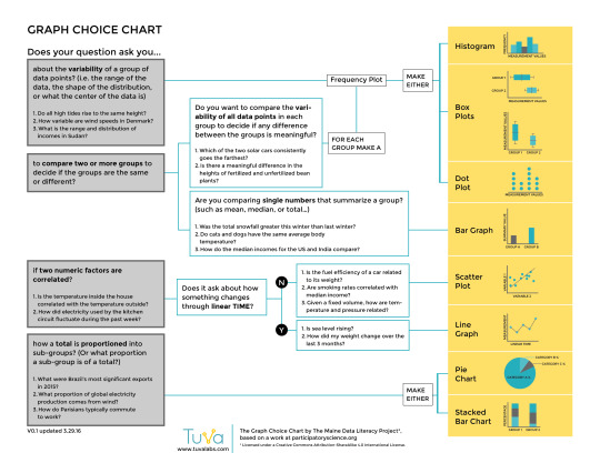
Screenshot of the Graph Choice Chart
Students are prompted to clearly state (write out!) a complete question in one of these forms, and then to follow a decision tree for choosing – based on the nature of their question – what kind graph would make sense to use for developing their evidence.
In addition to helping students clarify the purpose of their analysis, the GCC maps a framework for building statistical thinking and language, informally at first.
Students make deliberate decisions within the framework about what kind of question to ask, what kind of data are needed (categorical or quantitative), and what kind of graph makes sense for visualizing evidence.
It prompts them to adopt language for visualizing and describing variability in data, an underpinning of reasoning about data. Once they master these skills, they are ready to move beyond the GCC to more complex kinds of questions and more quantitative analyses.
Tuva is a perfect environment for putting the Graph Choice Chart to work, whether students are collecting their own data, or working with Tuva Datasets.
In future blogs, we’ll talk more about how early informal focus on variability supports the Common Core Math Standards and is a key underpinning to data literacy.
Download the Graph Choice Chart by logging into your Tuva Dashboard or the Tuva Resources section, and share it with your students and colleagues today.