Middle school science in Collierville, Tennessee, looks a lot different this year.
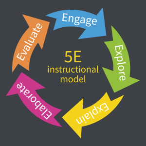
Less time is spent taking notes, reading, and answering question sets, and more time is spent developing models, conducting investigations, and discussing findings. The change comes from a new 5E-based curriculum, in which students construct their own scientific explanations.
Teaching Through a Curriculum Transition
The shift is not limited to Collierville. Science educators across Tennessee are teaching through a major transition: a new curriculum aligned to updated state science standards.
By law, the Tennessee Board of Education is required to review core academic standards at least once every eight years. In late 2022, the board approved a revised edition of the Tennessee Academic Standards for Science that was developed to explicitly “integrate disciplinary core ideas with crosscutting concepts and science and engineering practices.” In other words, the standards are intended to help students not just memorize scientific facts but actively use evidence and reasoning to make sense of the world around them.
A list of state-approved curricula aligned with the revised standards was released in 2024, and districts began implementation at the start of this school year.
Navigating the Change
Collierville Schools, located in a suburb of Memphis, opted to use STEMscopes™ Science TN as the curriculum for their 6–8 science students. Leslie Austin, a 7th-grade teacher at West Collierville Middle School, is a fan of the 5E instructional approach used by the curriculum. She admits, however, that they were worried at first.
“Turning over the reins to the kids is a shift for a lot of people, and it can be really hard,” said Austin. “But it is really cool to see, if we give them the tools and access to the information, what they can discover.”
STEMscopes™ is one of six state-approved middle school science curricula. Each requires a similar shift: from consuming knowledge to actively building it.
Actively Making Sense of the World
A central feature of Austin’s classroom is a whiteboard coated with sticky notes. On each note is a student-generated question that links back to a real-world situation students are attempting to explain.
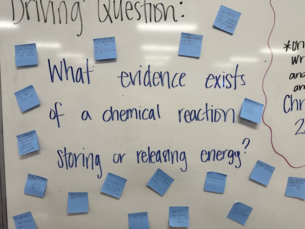
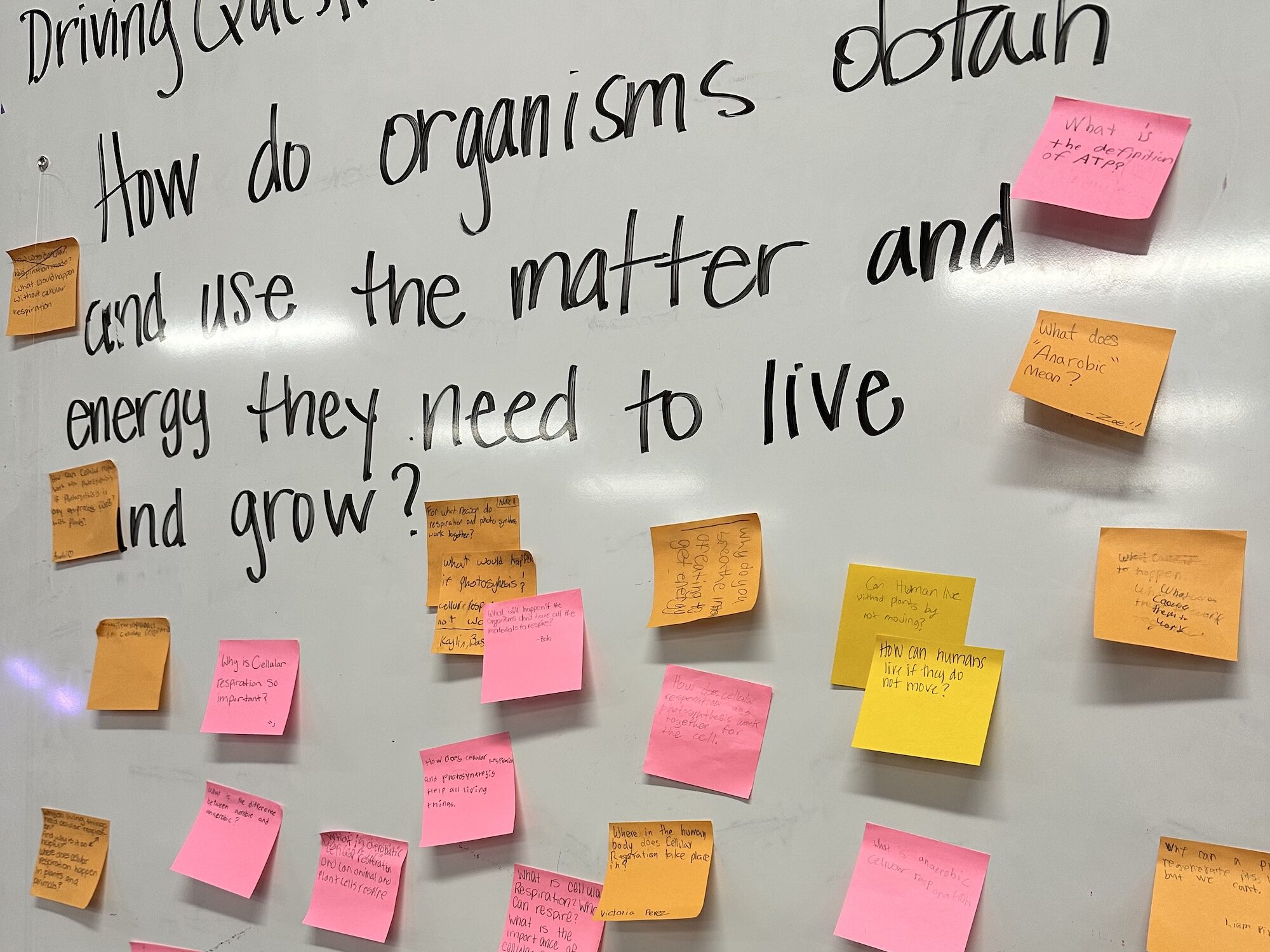
Austin’s driving question boards from semester 1 (left) and semester 2 (right). Austin has noticed an increase in both the number of questions and in “piggybacking”, or adding to each other’s questions.
As the unit progresses, students plan and conduct their own investigations and analyze others’ research to answer their own questions and, ultimately, construct an explanation of the phenomenon. Austin loves the “a-ha” moments when students make a discovery that connects to the question board.
“The kids get to answer those questions for their classmates. They start getting excited and wanting to know more. They are going to remember that more than me reading them something,” said Austin.
Data’s Role in Sensemaking
Data plays a crucial role in the student sensemaking process. Austin encourages her students to make claims using data from investigations they have conducted themselves or from a reliable study, but doesn’t permit them to just look up an explanation on their cell phone.
“AI can make up anything, but what backs it up? What makes it true? How do you know?”
“AI can make up anything, but what backs it up? What makes it true? How do you know this is the boiling point? How do you know the cell works this way? I want them to figure out the answers on their own.”
STEMscopes™, also recognizing data’s importance, bundled Tuva into their curriculum subscriptions for many schools. Tuva has since created a Tuva-STEMscopes™ Science TN Alignment Guide to make it easier for teachers to locate places where Tuva’s data-rich resources and graphing tools can be used to enhance the curriculum.
Tuva: Dual Learning Gains
“Where has this been all my life?”
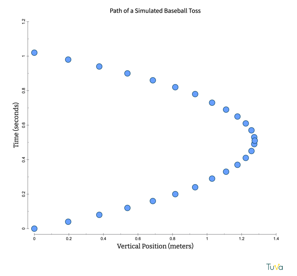
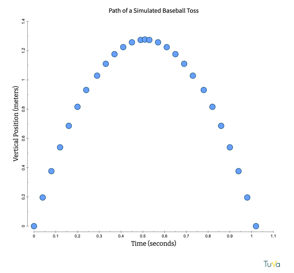
That’s how Austin described her reaction after using “Boiling Water Wherever You Are“, an activity she found on the Tuva‑STEMscopes™ Science TN Alignment. The activity helped students grasp abstract concepts about how pressure affects boiling point using real-world data, while also embedding vocabulary and building transferable data literacy skills.
Students practiced identifying positive and negative relationships, experimenting with which variables to place on which axis, and choosing the best type of graph to represent their data. Visual learners could see patterns emerge, and kinesthetic learners engaged directly by manipulating the graphs and testing ideas themselves.
For Austin, the most exciting part was seeing students take ownership of the data.
“It was something they had never done before—being able to choose what to put on the axes, change the colors, and see what patterns emerged. They could play around and see what they saw,” she said.
The Payoff
In Austin’s opinion, the new statewide approach does a much better job of engaging students and preparing them to ask questions, work with data, and defend their ideas.
Though the shift places new demands on teachers, Austin has noticed some advantages for them as well.
“It’s a lot of fun watching teachers like their jobs better.”
Teaching in Tennessee?
We’ve mapped Tuva resources to the Tennessee Academic Standards for Science. Search by grade level and standard here.