The Unique Challenges of Teaching About Environmental Injustice to Students Who Are Living It
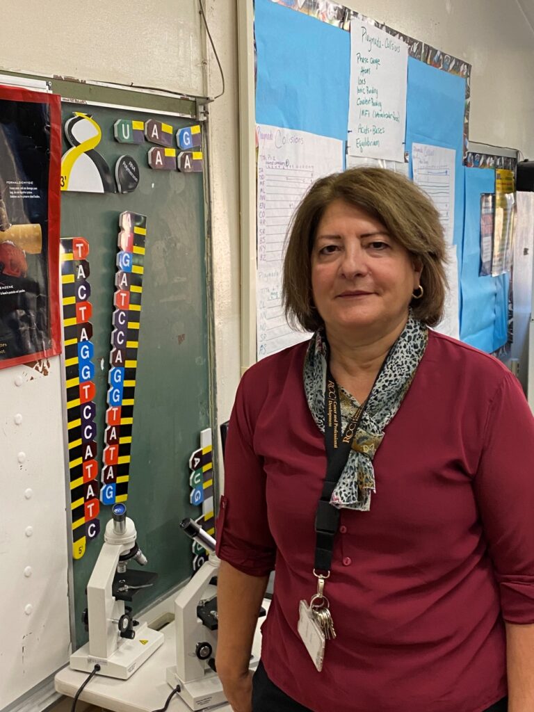
Satina Ciandro’s environmental science students have experienced environmental injustice firsthand, which, paradoxically, makes it harder to teach about climate change.
On the one hand, it’s personal- offering baked-in relevance. On the other hand… it’s personal. Which means it’s also emotionally fraught.
“It took me 23 years of teaching science to really teach about climate change. Not just mention it, really teach it,” admitted Ciandro.
A Student Body Familiar with Inequity
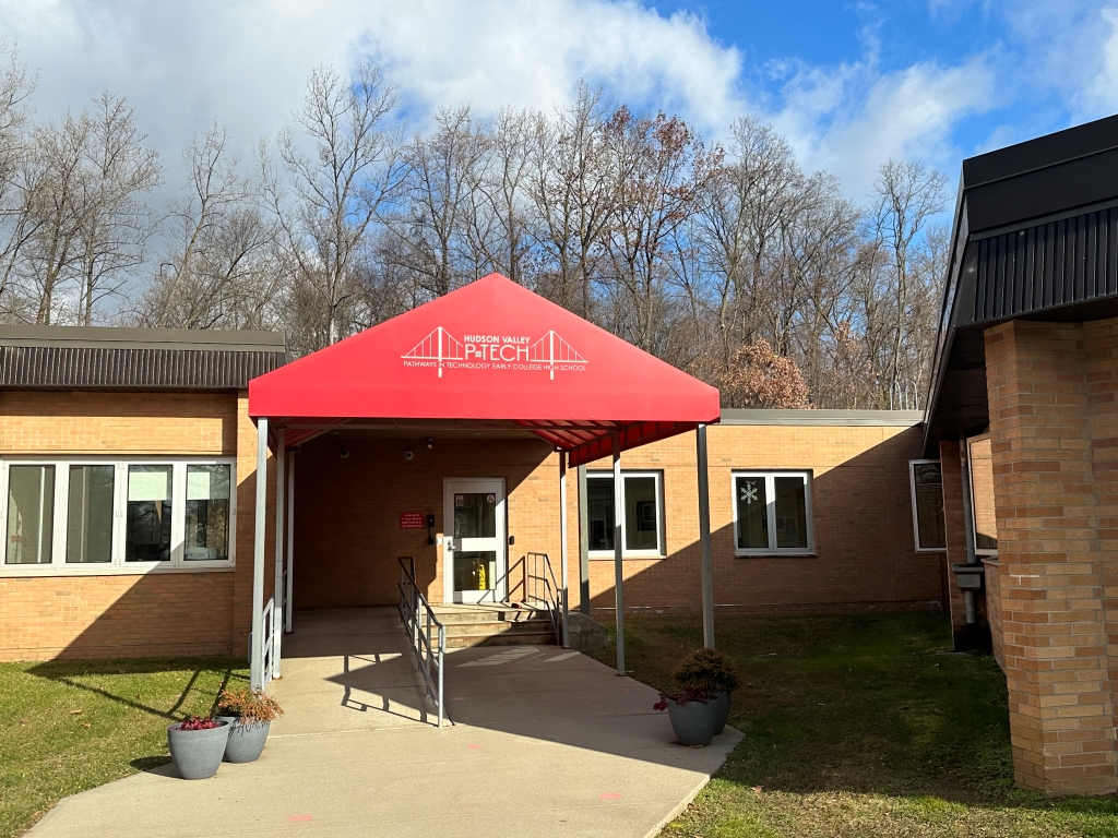
Ciandro teaches science at Watsonville High School, located in a small city in the Monterey Bay Area of California. 96% of her students are Hispanic. 88% of her students are economically disadvantaged.
“Most of my students are students of color and they understand injustice very well,” said Ciandro.
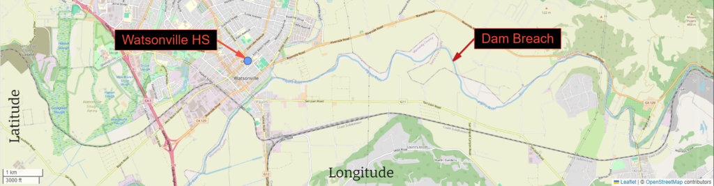
In fact, many of her students were directly impacted last March when the Pajaro River Levee was breached, flooding homes in a low-income community primarily inhabited by migrant workers and their families. Needed repairs on the levee had been deferred by the Army Corps of Engineers when their cost-benefit analysis concluded the low home values in the area didn’t warrant prioritizing levee repairs.
Getting Past the Paralysis
The breach is just one example of environmental injustice Ciandro’s students have faced. A 2021 Environmental Protection Agency study indicated, “…the most severe harms from climate change fall disproportionately upon underserved communities who are least able to prepare for, and recover from, heat waves, poor air quality, flooding, and other impacts.” Racial and ethnic minority communities are particularly vulnerable, they stated.
Ciandro’s hesitancy to really go deeply into climate change stemmed in part from recognition that discussing yet another example of environmental injustice would be triggering for her students. She worried her lessons would be all doom and gloom.
Ciandro also worried about her lack of perspective. How could she teach about an experience she had not had?
“I am a white lady… I don’t know what they are living through,” she said.
Getting it right felt insurmountable.
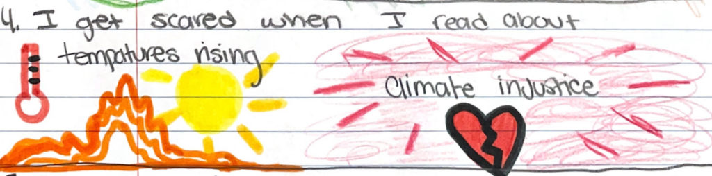
Over the past few years, Satina has picked up a few trauma-informed strategies that help her feel more comfortable delving into the science of climate change and all of its messy ramifications. She’s learned that providing time and space for students to process things that are emotionally triggering is imperative. Ciandro incorporates art, journaling, and other forms of reflection into her science instruction.
She’s also learned that focusing on solutions helps reduce the doom and gloom factor.
“You can’t just point out the injustice and not do anything about it,” Ciandro said.
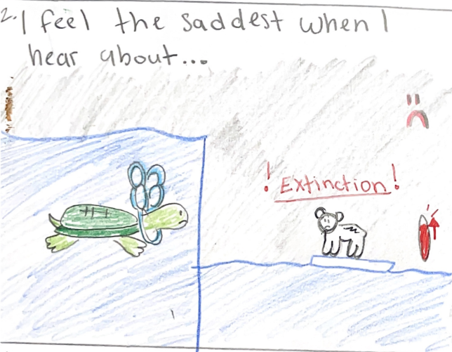
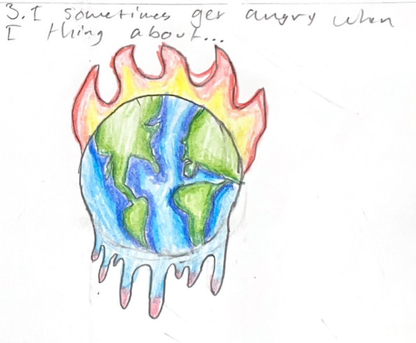
A recent study revealed 59% of young people ages 16-25 were “very” or “extremely” worried about climate change, a phenomenon increasingly known as eco-anxiety. Some eco-anxiety can spur people to action; too much eco-anxiety can have the opposite effect, leading to despair and inaction.
Having students take steps to help solve the problem can be empowering and can reduce anxiety. She cautioned, however, that you need to explore solutions in a way that does not put all the burden on the students to figure it out.
“That’s the point of the whole lesson- not to make you feel bad, but to consider what are the solutions, and how are we going to do the things to fix it?”
Striking the Balance with Urban Heat Islands
Recently, Ciandro applied these trauma-informed strategies in an urban heat islands unit. Ciandro was inspired to take this angle by Dr. Tammie Visintainer when she participated in her National Science Foundation-funded Climate Justice Action Research Summer Program at San Jose State University. The cohort of participating educators are all using urban heat islands as a lens to investigate climate justice with their students.
Urban centers tend to be hotter than surrounding rural areas. Materials like brick and pavement absorb and hold onto more heat than vegetation. This creates “islands” of heat. As the climate changes, heat-related deaths have also increased. Heat-related deaths in the United States spiked 59% between 2018 and 2022 according to the National Center for Health Statistics. People in cities are at higher risk of heat-related ailments.
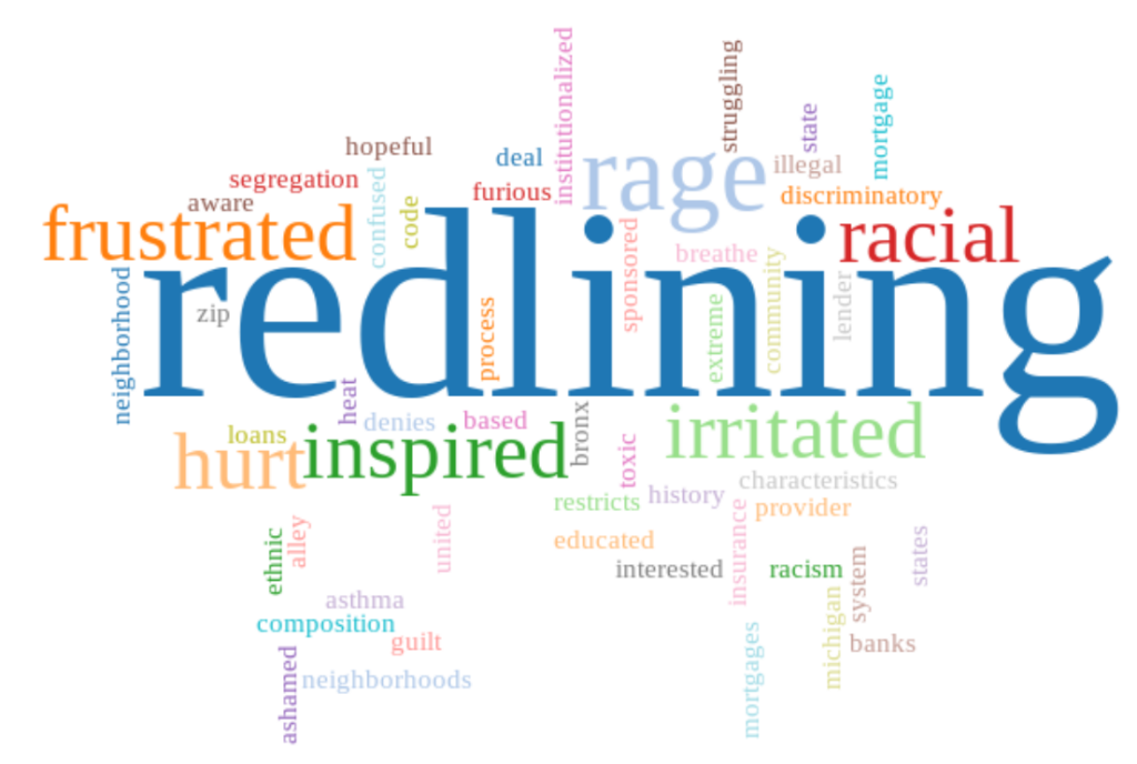
Ciandro knew from her program that even within the cities, however, the effects of heat are not felt equally. Urban areas with fewer trees get hotter. Urban areas with lower tree density usually have two other things in common: high minority populations and historical subjection to redlining. Redlining was a practice carried out by lenders to create policies around who they would lend money to.
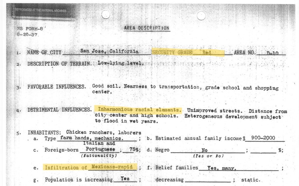
Certain districts were “redlined”. Mortgage lenders marked them in red on the maps, which meant they were coded as “hazardous.” Banks would not give mortgages to people buying homes in redlined districts. The rationale listed for assigning a specific neighborhood rating often cited race.
In nearby San Jose, California, for example, agents specifically noted one of these two reasons: “inharmonious racial concentration” or “heterogeneous” for five of 12 districts rated “hazardous.”
“When I went through history class in my white suburban school, I never learned about redlining. I did not know that it was on purpose and that it was systemic. I didn’t know. I know it’s not an excuse, but I’m learning with them,” said Ciandro.
Ciandro wants to make sure her students do learn about redlining. She designed a two-month long, project-based unit around the urban heat island phenomenon. Within the course of her unit, she wanted her students to discover the temperature differences; do some experiments to determine what factors affect temperature in our built environment; uncover the correlation between the 1930s neighborhood ratings and heat; and to take action to make a change.
How Tuva was Able to Help
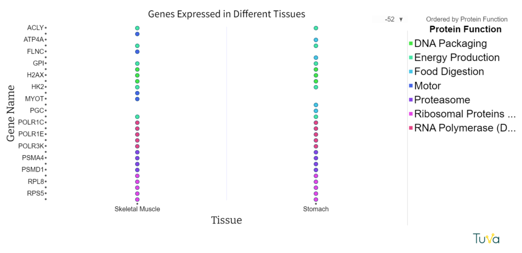
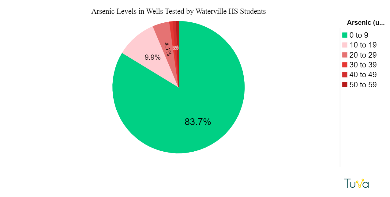
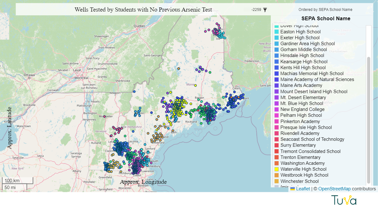
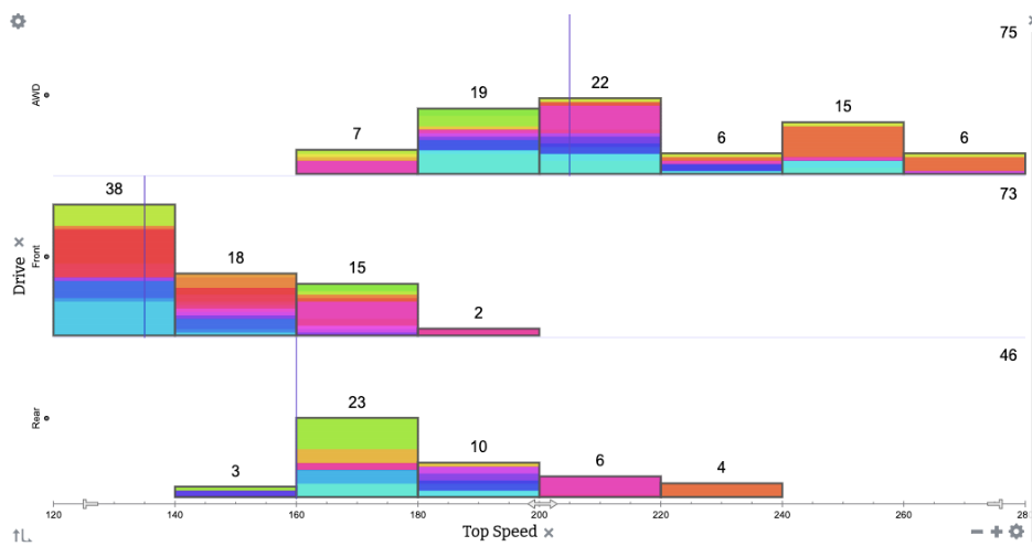
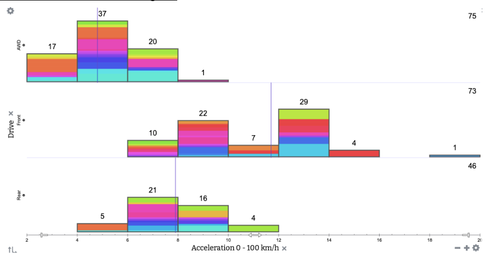
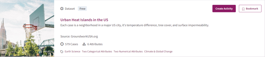
Ciandro found that premade graphic visualizations about urban heat islands are easy to find, but she wanted students to be able to explore and manipulate the raw data themselves. Discovering a relationship on your own as you tinker with data makes a bigger impression than observing it on a premade graph. Ciandro’s go-to program for data exploration is Tuva. Ciandro has been a loyal Tuva user for many years and uses at least one Tuva activity per unit in her environmental science course.
Ciandro immediately went to Tuva in search of a relevant dataset but was disappointed to find we did not have one. After a conversation with us this summer during which she expressed a need for a dataset about urban heat islands and redlining, Tuva team member Annette Brickley curated one. She located a 2020 research paper by Hoffman, Shandas and Pendleton from Groundwork USA. When Brickley reached out to ask for permission to use the data on Tuva, Hoffman generously shared their complete dataset. Tuva’s dataset pulls out data from seven of the U.S. cities included in Hoffman’s paper.
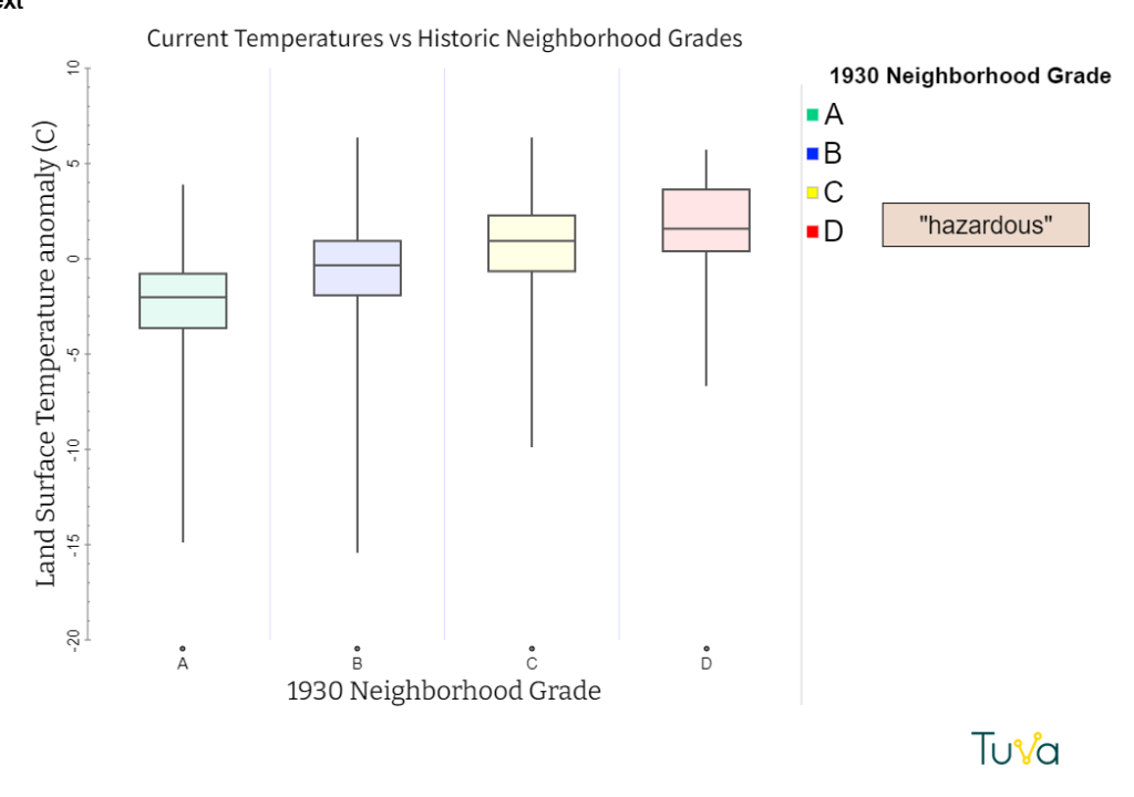
Later, Ciandro used Tuva’s Activity Builder to create a lesson that would help her students explore the dataset and discover relationships between neighborhood grade, tree canopy, impervious surfaces and temperature. The story the data tells is pretty bleak, but Ciandro manages to infuse hope at the end of the activity.
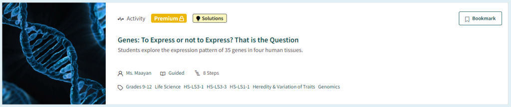
“Imagine you are a city planner and your job is to allocate funds for a major climate action grant,” she writes. “How will you distribute the funds to each type of neighborhood? Justify your answer using data.”(We liked her activity so much, we published it. Access it here.)
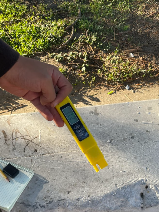
Ciandro’s students also collected data across the Watsonville High School campus. Each group selected two spots, collected surface temperature data once per week, and entered the data on Tuva. Through this exercise, they observed locations near concrete were consistently hotter than green spaces.
Student Empowerment
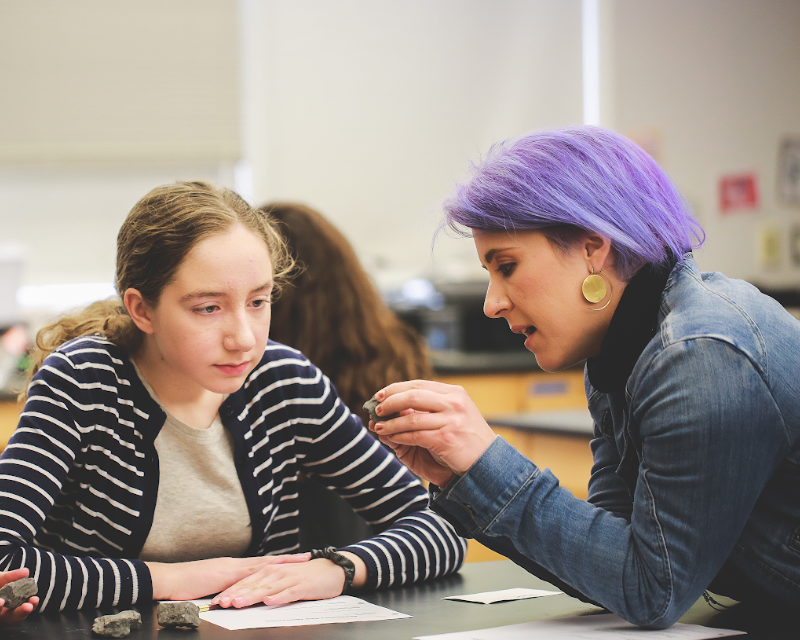
As the unit neared its end, four of Ciandro’s students – Jazmyn, Mario, Rocio and Anail- gathered around a Zoom meeting to tell me about their learning experience.
“I did not realize how impacted our little city is because it is so based on concrete,” noted Anail. “My (part of the) city is in the red line,” she added.
The other students agreed with Anail that the last few months have been eye-opening. Until this unit, they did not know urban heat islands existed let alone that extreme heat is worst in areas that were historically redlined. The other thing they agreed on was that everyone else in Watsonville should be made aware of the problem too. Jazmyn laid out her hopes for her community.
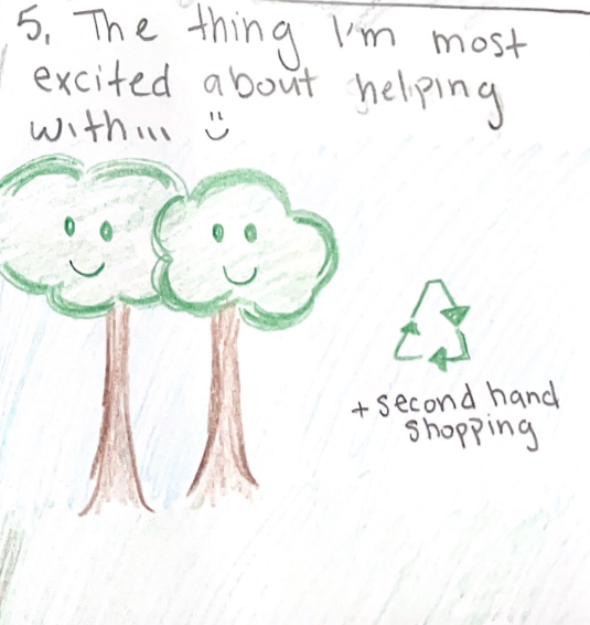
“I want them to get a better idea of how it actually affects us in our daily lives, I want them to not feel negative because there are solutions to it, and I want them to come together as a community to plant more trees,” she said.
As a culminating project, student teams created podcasts to help educate their community. The podcasts, which they plan to submit to the KQED Youth Media Challenge, played the dual role of helping students process injustice and giving them a way to fight back against it. (Want a sneak peek before they’re live? Listen to Jazmyn and Mario’s submission here.)
Teaching Tough Topics: “Something We Need”
Ciandro says teaching tough topics helped her grow as a teacher.
“It helped me as an educator to teach something that is tough to teach. It is a different way of teaching, and it’s something we really need,” said Ciandro.“You have to do your best and hope you are going to do more good than harm.”