In July, California passed an updated Mathematics Curriculum Framework, which outlined major shifts in how the state expects schools and districts to approach math instruction. Our math team is excited about the new emphases of the framework and how Tuva is uniquely positioned to support them.
“We look forward to building on our ongoing substantial work with California educators to dedicatedly support the state’s math teachers, schools, and districts as they look to adapt and update their existing math instruction to teach data literacy and data science to their students,” says our co-founder, Harshil Parikh.
We’ve outlined below some of the major shifts and additions, and highlighted ways our work can support California math educators to be prepared for what’s to come.
Data Literacy and Data Science Emphasized
The California math framework is clear: data literacy and data science should be emphasized throughout the K-12 math ecosystem. In fact, the framework dedicates an entire chapter (Chapter 5) to Mathematical Foundations for Data Science.
“Students should have equitable access to data literacy and introductory data science at the K–12 level to facilitate equitable participation in a data-driven world as adults.” (Chapter 5, Page 5)
The chapter lays out how data science fits into each grade band, as well as thematic topics within the California CCSS-M that directly support data science. Topics like: understanding variability, the data collection process, and comparing and finding associations between variables.
As an organization founded on the belief that data literacy skills are crucial for students’ success in school and beyond, we’re excited to see California join a growing number of states in recognizing the importance of data literacy and data science throughout the K-12 pipeline.
We also know that teaching data literacy skills can be daunting. To support teachers in understanding where their students should be in their data literacy skill-progression across grade bands, we’ve developed a comprehensive data literacy framework that outlines the major skill areas students should progress through as they deepen their data literacy skills.
Data is a Vehicle Through Which Math Content is Applied
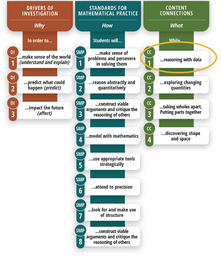
In this iteration of the framework, California has introduced Content Connections, which “embody the understandings, skills, and dispositions expected of high school graduates (Chapter 1, Page 22).”
You can think of these content connections as the vehicle through which students are applying their understanding of the standards. So, for example, if a sixth-grade student is learning about fraction relationships, one of the ways they may apply their knowledge is by reasoning with data.
At Tuva, this is already how we approach the development of math content. We see data as a way for students to both learn and apply their mathematical knowledge, while hopefully engaging with a context that is fun and relatable.
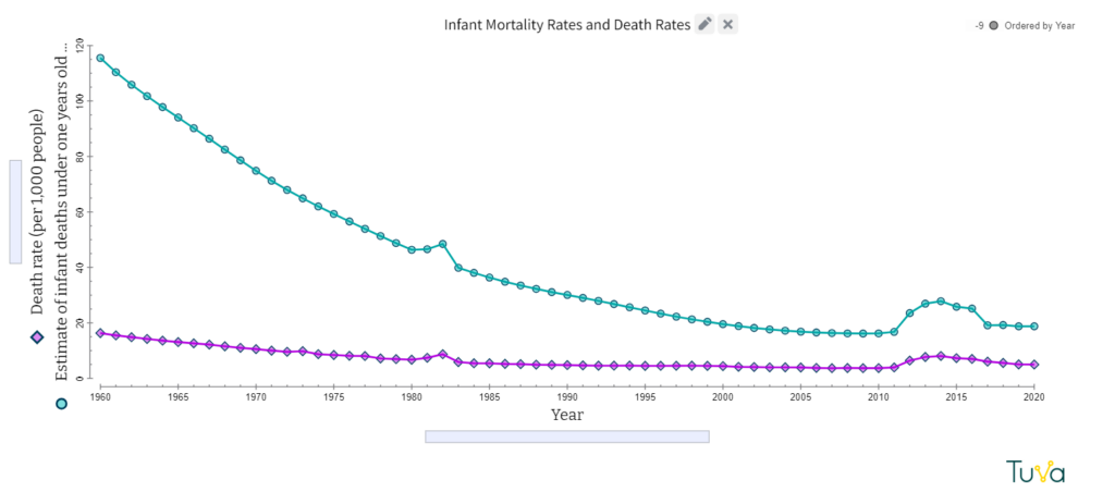
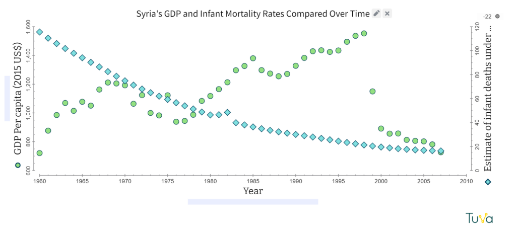
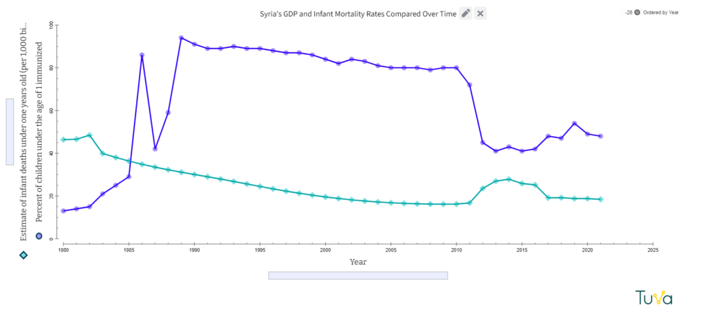
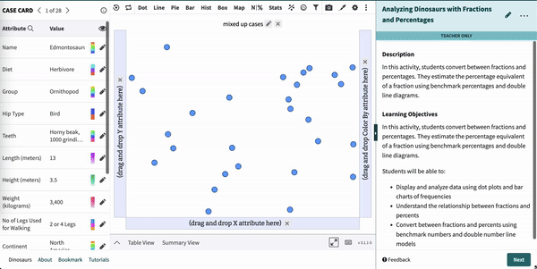
For example, in our 6th-grade activity Analyzing Dinosaurs with Fractions and Percentages, students use their understanding of part-to-whole relationships to analyze an interesting dataset on 28 commonly known dinosaurs, and ultimately make claims about the types of dinosaurs that existed across geological periods.
Moving From Clusters to Big Ideas
While the framework didn’t change the actual language of the standards (California continues to use the California Common Core State Standards for Mathematics), it did outline a reorganization of the standards around “Big Ideas” rather than the previously used “Clusters”.
Like most states that use the Common Core, California previously identified major grade-level clusters, which served as a way for educators and curriculum providers to identify the most important standards within a course. Those same priority standards are still identified via the size of each concept bubble in the course’s big ideas map (shown below).
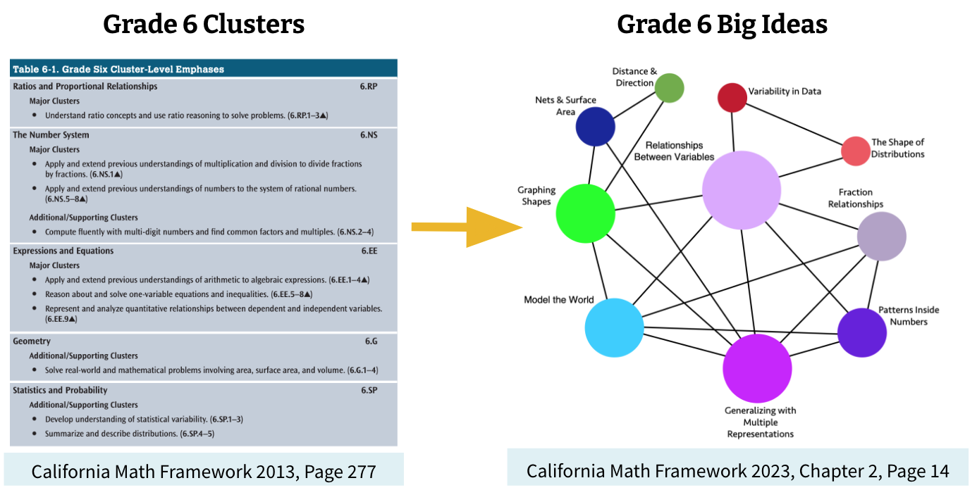
While the big ideas maps for each grade level may at first look intimidating, they serve a pedagogical purpose: to help both learners and teachers of mathematics come to view math as a series of interconnected concepts that spiral across grade levels.
“Standards and textbooks tend to divide the subject into smaller topics, but it is important for teachers and students at each grade level to think about the big mathematical ideas and the connections between them .” (Chapter 2, Page 12)
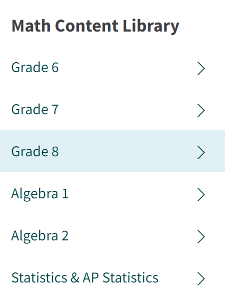
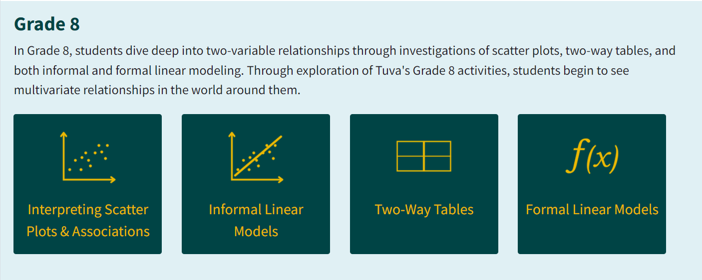
Here at Tuva, we recently reorganized our math content library to focus on the big ideas of each grade level – specifically those which have strong potential for data applications.
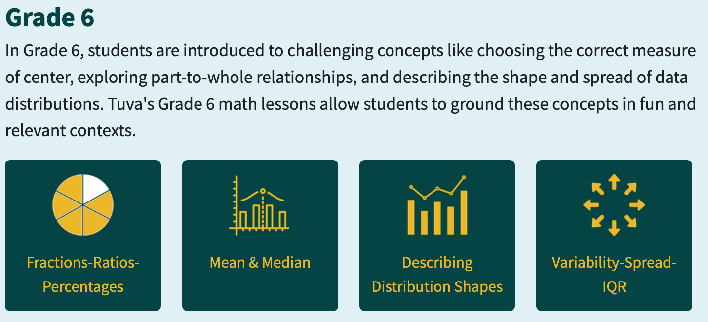
The design of our new math library is intended to help teachers see the connections between content standards in their course and find rigorous data investigations that can support students’ conceptual understanding of the topic. Our content library buckets are intended to encompass multiple standards and will naturally have some conceptual overlap. Learn more about our reorganization in our recent blog post.
Student Engagement is Coequal With Content Mastery
The California framework makes it clear that student engagement in math is just as important as student mastery of content standards:
“When students are engaged in meaningful, investigative experiences, they can come to view mathematics, and their own relationship to mathematics, far more positively. By contrast, when students sit in rows watching a teacher demonstrate methods before reproducing them in short exercise questions unconnected to real data or situations, the result can be mathematical disinterest or the perpetuation of the common perspective that mathematics is merely a sterile set of rules.” (Chapter 2, Page 9)
If you’re familiar with Tuva and our vision for math and science education, this sentiment will feel very similar to our vision statement:
“Tuva envisions a world where every student experiences the joy of learning math and science through real-world contexts. We imagine a future in which all students possess data literacy and use it to contribute positively to society.”
And this isn’t just an empty vision statement; our teachers are already exemplifying the possibilities of teaching mathematics in this way. Read our previous posts about math teachers like Chad Boger and Annie Pettit who are making the learning personal and relevant for their students using Tuva tools and datasets.
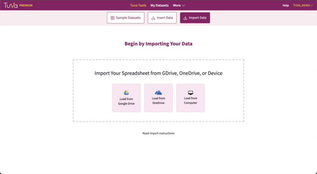
Get Started Using Data in Your Math Instruction
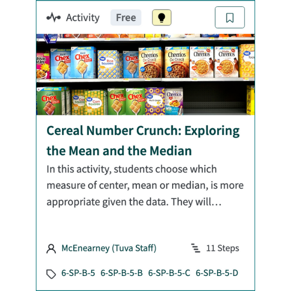
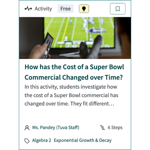
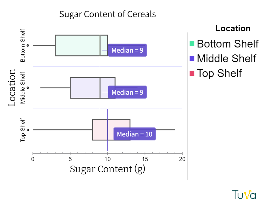
If you’re looking for a place to get started integrating data into your math instruction, we have a few suggestions. This free middle school lesson on choosing the correct measure of center hooks students through an exploration of popular breakfast cereals and their nutritional content. For high school applications, try out this free lesson exploring the exponential growth of the cost of Super Bowl commercials over the years.