There are 300+ Tuva Datasets in our library covering topics such as the Climate Change, Land & Sea Animals, Presidents of the United States, and many many more.
Today, we are excited to do an initial launch of a more powerful Filter Bar to meet the diverse needs of our educators within the Tuva community.
A More Powerful Filter Bar:
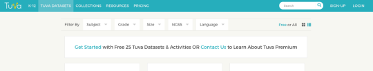
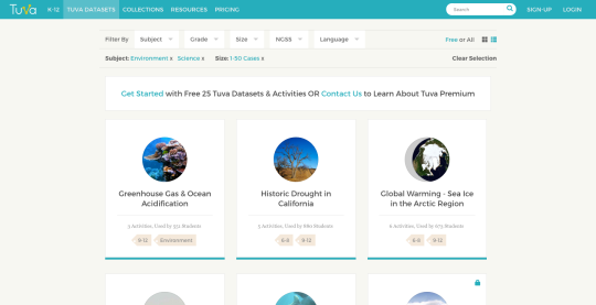
Now, if you wanted to find all the Science or Environment-related Tuva Datasets that are small in size, you can find them very quickly by choosing Science & Environment in the Subject drop-down and 1-40 in the Size drop-down, like this:
As you can see above, you can now filter and find Tuva Datasets based on a number of additional parameters beyond Subject & Grade Level such as:
- The Size of the dataset (How many data points are there?)
- The NGSS standard (particularly relevant for all our US Science Educators)
- The dataset Language (For our non-English speaking educators and learners)
Now, if you wanted to find all the Science or Environment-related Tuva Datasets that are small in size, you can find them very quickly by choosing Science & Environment in the Subject drop-down and 1-40 in the Size drop-down, like this:
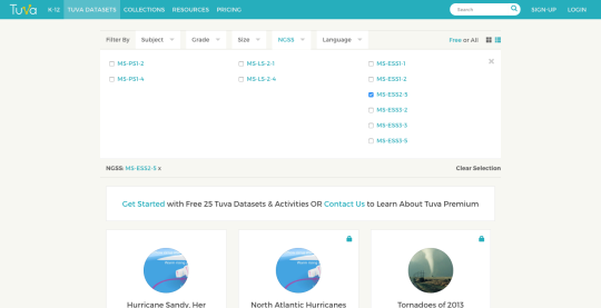
Or, if you wanted to find a dataset that is related to the MS-ESS3-5 (Earth & Human Activity) NGSS Standard, you can find it very quickly by choosing MS-ESS3-5 in the NGSS drop-down, like this:
Send Us Your Favorite Datasets & Win
Do you have a favorite dataset that you have used in your previous lessons or units? Does it come from an authentic source? Is it licensed under Creative Commons? Are you able to link to it?
Send us your favorite datasets to hello@tuvalabs.com over the next two weeks and enter a chance to win a Tuva T-shirt, a Tuva Coffee Mug, and other goodies!