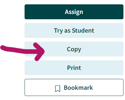
Tuva is excited to announce the release of a feature that makes it possible for teachers to customize activities. The ability to copy and revise activities went live this past Friday.
Previously, if a teacher wanted to change something minor, it was a time-consuming process. First they had to create a brand new activity using Tuva’s activity builder and copy the text of each question one at a time. Then they could make the desired changes. Now, teachers can customize in a fraction of the time.
“We are excited to support our teachers in the new school year with the launch of this feature. Teachers can now easily edit and personalize Tuva’s library of inquiry-based science and math lessons to meet the unique needs of their classrooms and students,” said Tuva co-founder and CEO Harshil Parikh.
Tuva Premium subscribers are able to copy and revise any activity in Tuva’s extensive math and science content library, which currently houses more than 350 activities.
Nate Sebold Champions Authentic Data to Surface Social Justice Issues and Boost Inclusion
One of the things Putney, Vermont, teacher Nate Sebold loves about middle school students is that they are full of questions. He considers it his job to “harness” those questions and give kids the tools they need to answer them. For Sebold, that means having students interact with data.
“How to interpret data, how to question data sources, how to investigate data – these are increasingly important for today’s 13-year olds. Data is going to be such a huge part of their lives,” said Sebold.
According to Sebold, contrived data won’t cut it. He prefers to use real-world data. His reasons are twofold: social justice and classroom inclusivity.
Surfacing Social Justice Issues with Data
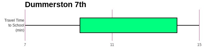
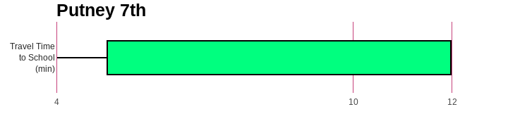
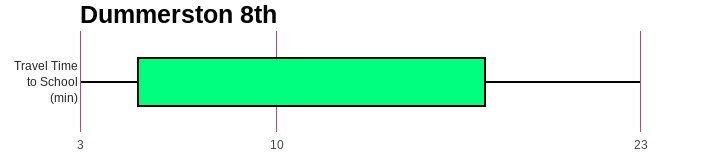
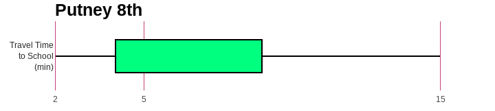
Sebold experienced an aha moment at a National Council of Teachers of Mathematics conference. The presenter pointed out that teachers make a choice when they place a graph in front of students. The graph can be about something socially relevant, or not. Since then Sebold selects data carefully with an eye to surfacing important social justice issues. For example, Sebold regularly uses the Tuva activity Incomes of Men and Women in the US: Comparing Groups with Box Plots. Sebold said that introducing relevant data, like this dataset, in the classroom creates a space for students to ask questions and increases classroom dialogue.
Boosting Inclusion by Helping Student Connect Personally to Data
Another advantage of real-world data, Sebold said, is that it benefits students with learning differences.
Before taking the job at Putney Central School in 2022, Sebold spent a number of years as math department head at the Greenwood School, a small college preparatory school for students with learning differences. He and his science colleague noticed a real difference in conceptual understanding of data when students had collected it themselves.
“When they would sort it… they would say, ‘there’s my point in the midst of all the others!’ The data meant something.”
Sebold explained that when students saw that the graphs were not just randomly created, but made up of points of data they had collected, it helped them comprehend that all graphs are made up of individual data points. Data visualizations became more concrete.
In one project, Sebold’s students entered their own demographic data into Tuva. Sebold notes students’ comprehension of graphs increases when they help with the data collection process.
“When we pulled the data up on Tuva, they would try to find their own response, their data point. Then, when they would sort it or organize it, they would say, ‘there’s my point in the midst of all the others!’ The data meant something,” Sebold said.
Inspired? Surface social justice with these resources.
Tuva Lessons and Datasets About Current Social Issues
Science Teacher Margo Murphy Does Science From Day One
When most people think “back to school,” it conjures images of students seated at a desk, their heads bent over their computers and papers. In Margo Murphy’s Earth Systems Science classroom, though, “back to school” has a different meaning. Murphy jumps right into doing science. That means the first days back find her students outside in their Rockport, Maine schoolyard collecting data.
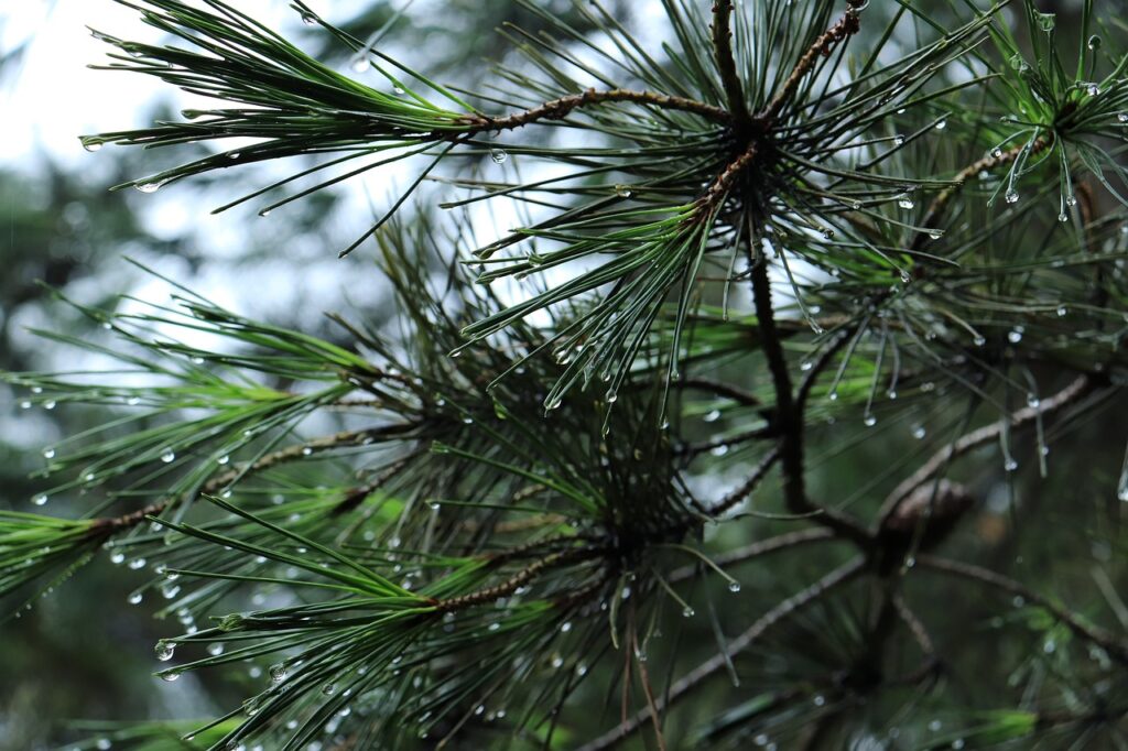
At first, the content of the investigation doesn’t matter; what matters is if observational data can be gathered to answer the question. Each group picks a question that sparks their interest. For logistical purposes, Murphy limits them questions they can answer on campus. For example, one group of students might be measuring the length of white pine needles to see how variable they are while another is documenting the brands, models and colors of vehicles in the school parking lot. The purpose?
“It gives kids the idea that you can have highly variable data but still see trends,” Murphy explained. This is fundamental in her Earth Systems course, she elaborated. “You are going to have messy data if you are going to work in the earth sciences.” Murphy and her Earth Systems colleagues at Camden Hills Regional High School consider data literacy so essential to the earth sciences that they devote a significant portion of the first quarter helping their students master it.
“They don’t have to focus on getting it ‘right’ the first time, so they can iterate.”
Once students have collected data, they upload their data on Tuva and begin to explore it. Murphy’s students always enjoy the “playground aspect” of Tuva, being able to bring data in and look at it in a variety of ways. To capitalize on this engagement, Murphy builds in time for her students to “play”.
“[With Tuva] they don’t have to focus on getting it ‘right’ the first time, so they can iterate,” Murphy said.
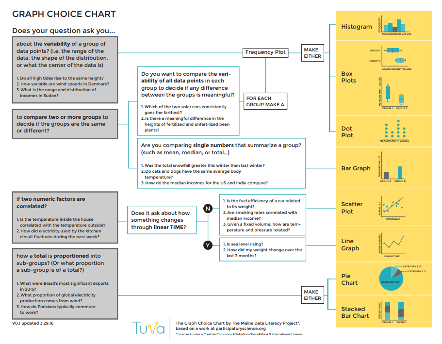
Murphy scaffolds learning using Tuva’s graph choice chart.
As students are becoming conversant with analyzing complex data, Murphy scaffolds the learning process using Tuva resources like the graph choice chart.
The time and energy devoted to data literacy pays dividends later in her course as students grapple with complex earth systems core ideas such as weather and climate, topics which Murphy considers vitally important.
Murphy introduces data skills early, preparing students to apply them to projects like this one later in the course.
“I want kids to understand that there is change on the planet, that this change is rapid, and how they can find evidence and understand that evidence to understand these changes and ask good questions.”
We are excited to unveil a brand new look to the Tuva Datasets Library!
As the number of datasets, activities, and lessons continues to increase on the Tuva platform, we are striving to make it easy for you to filter and find the right curriculum resource that meets your needs.
Screenshot of the new Tuva Datasets Library
The new Tuva Datasets Library page is arranged as follows:
Find all the Filter categories and sub-categories on the left sidebar.
Filter by Subject / Topic, Grade Level, Science (NGSS Core Ideas), Math topic, Dataset Size, Place / Region, and Language.
Easily switch between 15 free datasets (Tuva Basic) and All datasets (Tuva Premium) in the library.
Easily toggle between Block View and List View for all resources.
Quickly find all the archived datasets and activities.
Stay tuned for additional updates and enhancements to the new Tuva Datasets Library!
The Tuva Datasets Librarycontinues to grow, with new datasets, activities, and lessons added on a regular basis.
Thousands of educators around the world use the Tuva Datasets, the interactive graphing and data tools, and inquiry-based activities to effectively address math and science standards, concepts, and practices in their classrooms.
As we curate and add new datasets and activities to the Tuva Datasets Library, it it becoming essential that the library is kept fresh.
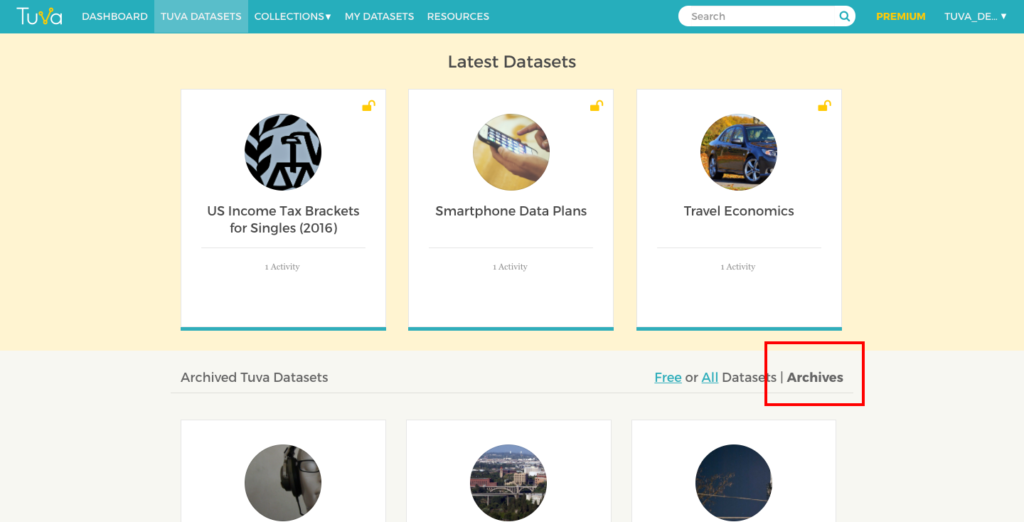
What can we do to preserve many of the older datasets that are no longer be relevant? Today, we are introducing the Archives section within the Tuva Datasets Library.
Archives Section on the Tuva Datasets page
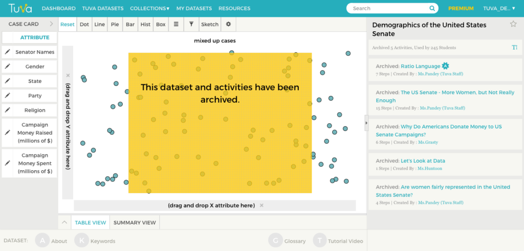
Once a free or aTuva Premium dataset is archived, it will be placed in the Archives section of the library.
Once the dataset is archived, all the activities and lessons related to that dataset are archived as well.
Screenshot of an archived dataset.
The archived datasets and activities will appear in the Search results, but they will be clearly marked as ARCHIVED.
The Archives section will ensure that the Tuva Datasets Library remains fresh, and that you are able to find the datasets, activities, and lessons that meet your needs.