Youth Robotics Team Uses Data to Call for Change

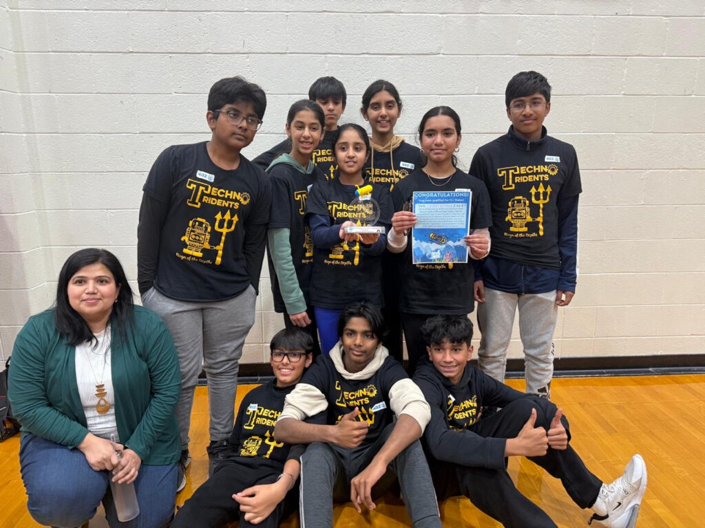
A team of ten Massachusetts 12- and 13-year olds want community members in the Narraganset Bay Watershed to change their behavior.

Their advice? Apply phosphorous-free fertilizers, use plantings to filter water, and convert impervious surfaces to absorbent ones. All of these changes, they say, will help prevent harmful algal blooms (HABs) in the bay.

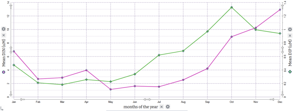
A multi-line graph shows how mean dissolved inorganic nitrogen (DIN) and dissolved inorganic phosphorous (DIP) changed throughout the months of the year. Both began to rise in May. DIP peaked in October at around 1.3 micrograms per liter. DIP peaked in December at just under 13 micrograms per liter.

The students reported, “Phosphorous, even in tiny amounts, can trigger HABs,”

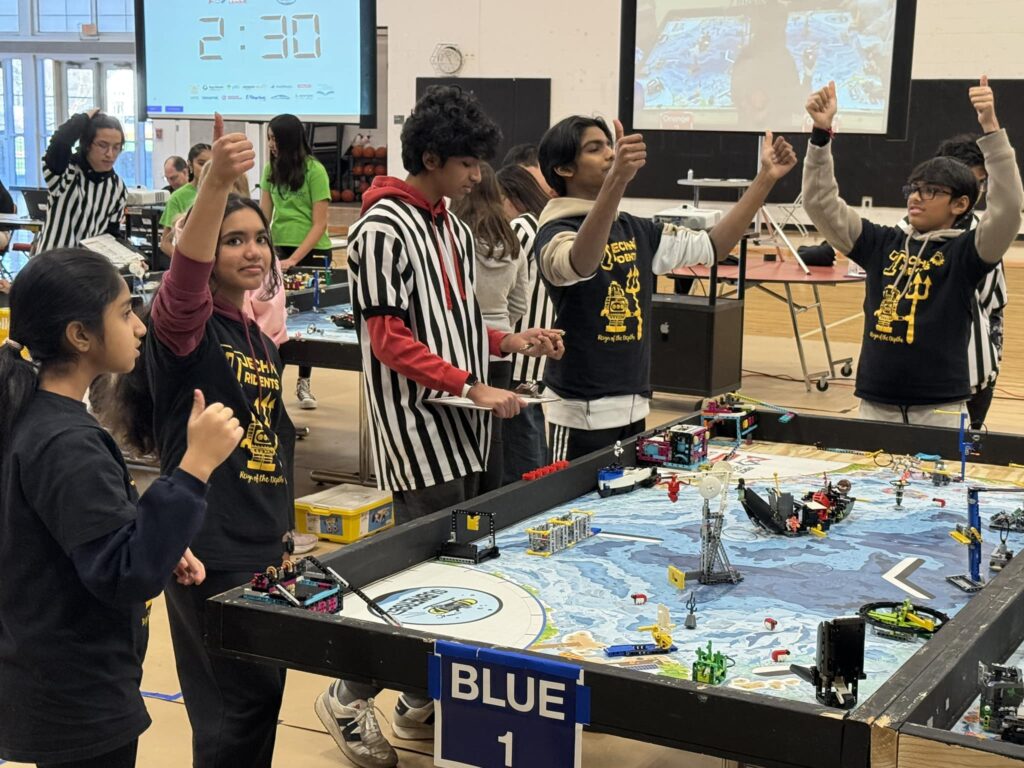
The youngsters, who call themselves The Techno Tridents, are all members of a robotics team from Eastern Massachusetts. They became concerned about the nearby estuary this fall when they began preparing for the 2024-25 FIRST LEGO League Challenge. The annual challenge always includes two major parts: designing a robot and conducting a research project. The research portion requires teams to identify a problem related to the year’s theme, find out as much as possible about the problem, and work out an innovative solution. This year’s challenge theme was “submerged” and centered around oceanography.

The Techno Tridents quickly became intrigued by HABs, particularly an infamous Narragansett Bay bloom in 2003 that resulted in massive fish kills and shellfish recalls. The team wanted to know what brings about these blooms.

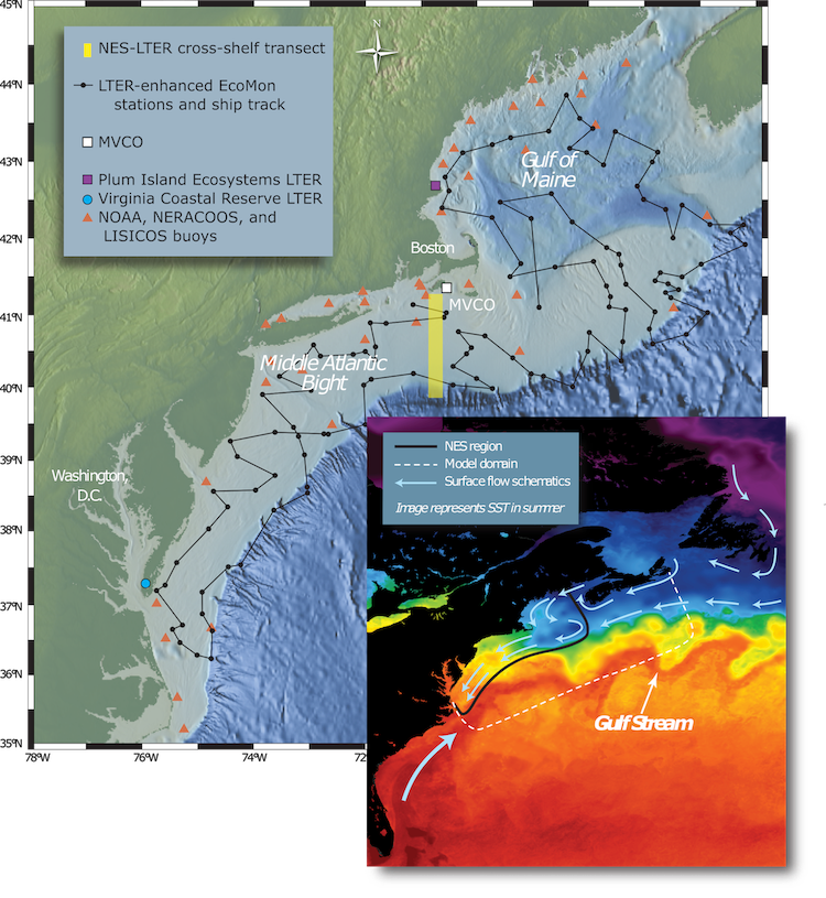
The team’s coach, Pallavi Naravane,  pointed the students toward the Northeast U.S. Shelf Long-Term Ecological Research (NES LTER) project. The NES LTER Schoolyard Program provides a series of datasets for use by middle and high school students. 

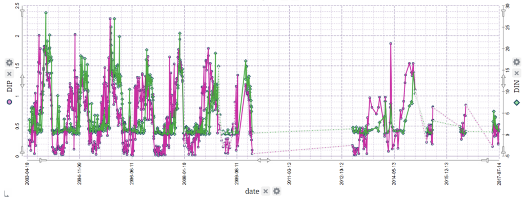
The first dataset The Techno Tridents used. Explore it in Tuva.

The dataset most helpful for their inquiry was about nutrient levels in Narragansett Bay and comprised 1,229 datapoints. It was marked “advanced- HS recommended.” The columns across the top of the spreadsheet simply listed date, depth, NH4, DIP, NO3 + NO2, NO3, NO2, and DIN. The problem? Many of the Techno Tridents had not yet completed a middle school chemistry unit let alone a high school chemistry class.

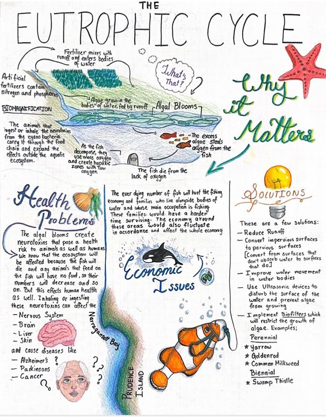
Poster created by 8th-grader Akshita Serikar,

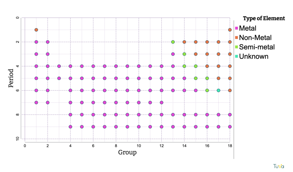
To fully understand the data, the team needed to learn more about science concepts above their grade level such as the nitrogen cycle, the Periodic table, valency, ionization, pH, and eutrophication.

“There was a huge learning curve,” said Naravane. She laughed, admitting that, as an engineering teacher, she was included in that learning curve. “I just let them lead it,” she said. 

The students now faced the challenge of making sense of a complex, multivariate dataset. This is where Tuva became indispensable. The students uploaded the data provided by NES LTER into Tuva for analysis.

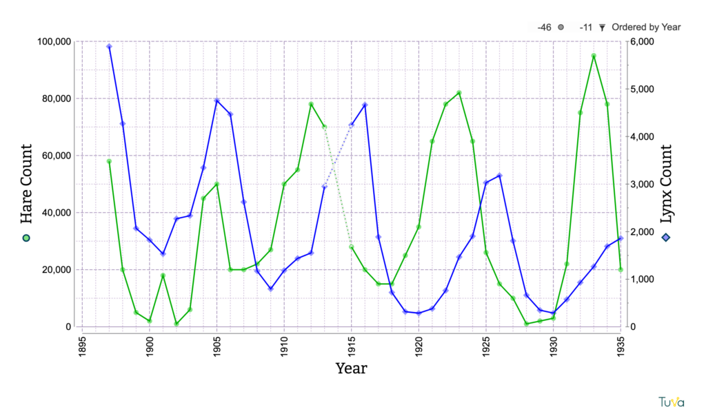
Naravane described Tuva as a “centerpiece” in helping her students uncover associations between variables. Using Tuva, students explored data analysis techniques. They learned how to add two variables on one axis, create dual-axis charts, and identify correlations. Tuva’s intuitive tools gave them insights that other software couldn’t match.

“Tuva labs is very sophisticated in the way that it allows you to see data,” Naravane said.

The story the data revealed was compelling: nutrient levels in Narragansett Bay spiked in October and November. Intrigued, the students sought to uncover the reasons behind this pattern.

The Techno Tridents included this graph in their project summary, writing, “The nitrogen and phosphorus spike in the fall… It is repetitive and we can see that the spikes are always more than 16uM of Nitrogen and 1.5uM of Phosphorus in October-November.

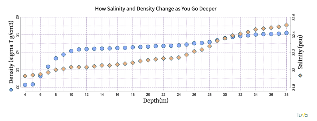
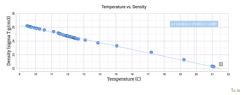
To build a more complete picture, they explored additional attributes like temperature, rainfall, salinity, and occurrence of phytoplankton species. They discovered that October is when the water reaches its warmest temperatures and more rainfall occurs, contributing to increased runoff. This surge of nutrients, combined with peak temperatures, create ideal conditions for algal blooms.

Try using Tuva to look for relationships between sea surface temperature and phytoplankton.

Their analysis didn’t stop there. Using maps, the students noticed a high density of golf courses and lawns in the Narragansett Bay Watershed. Further research revealed that fall is a common time for lawn fertilization, adding another piece to the puzzle.

“We found a lot of these rabbit holes of science we could walk off into. And that’s exactly the kind of science learning I want,” Naravane said. “ You never get a chance to learn other things, unless you are powered by curiosity.”

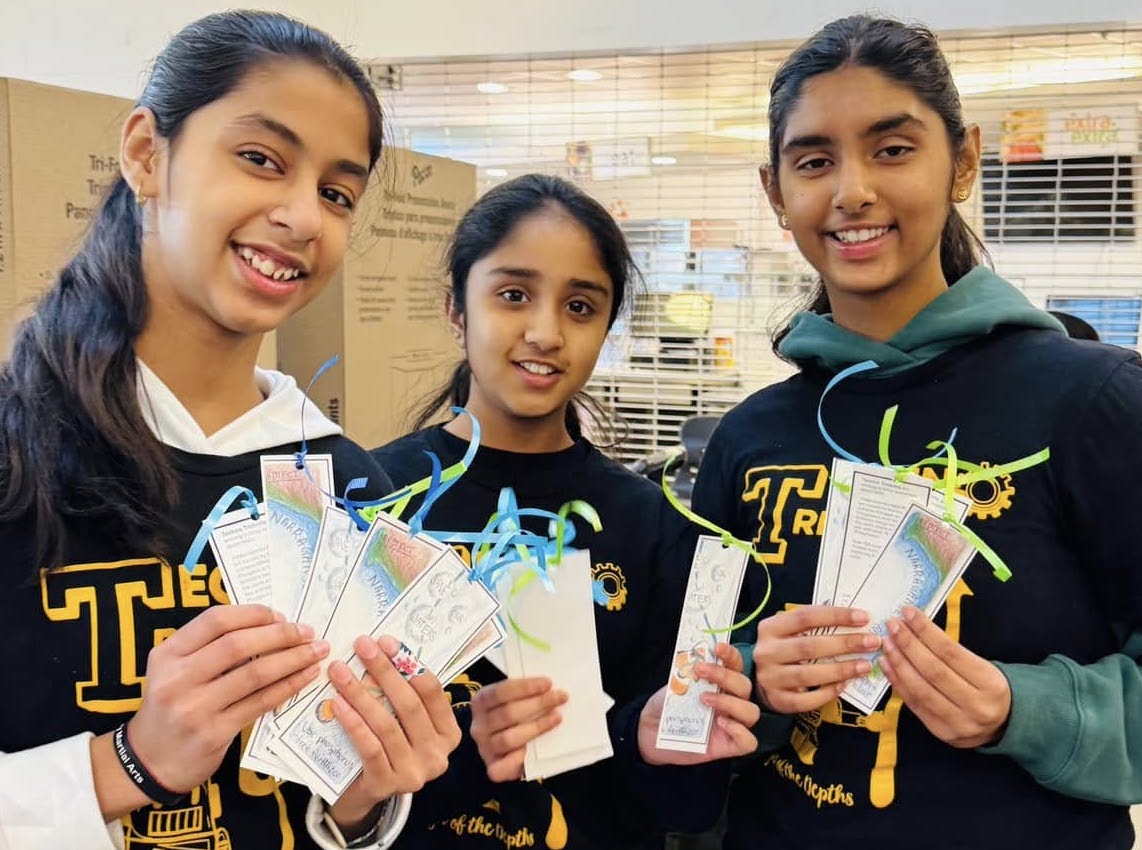
Based on all of the data, the students decided to launch a campaign to educate their community about responsible fertilization techniques. Their campaign included a variety of modes of communication:  bookmarks with illustrations on one side and information on the reverse; an intricate, hand-drawn poster; and a Scratch animation.

Their data-backed campaign, along with their robot, helped the Techno Tridents land a second place finish in the Northborough FIRST LEGO League qualifier. Their work has also attracted the attention of other local organizations- including environmental non-profits looking to collaborate and a science-based art gallery that is going to display Serikar’s art (above).

Naravane coaches six teams via her small business Planet Robotics. Her work with students mainly centers around engineering. She is convinced that data needs to play a larger role in the engineering process.

“I really believe data is a new way to see things,” Naravane said. “If you don’t know what you are studying, how do you know it is a problem?”

Do Kids Need to Learn to Graph by Hand? 

Knowing how to create graphs by hand is an essential skill. 

That may have been unexpected, coming as it does from the blog of a digital graphing tool. However, it’s important to clarify that using a graphing tool, like Tuva, and manually graphing are not at odds with each other; nor does one necessarily serve as a prerequisite. In fact, as the middle school science team at Northwest Middle School discovered, the two approaches are synergistic.

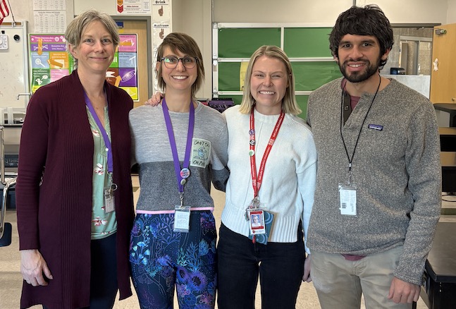
Northwest MS teachers Judith Neugebauer, Victoria Mauro, Anne Salisbury, and John Pikus.

“[Our students’] ability to see the numerical data in a graphical form is really transitioning from one realm to the other,” explained teacher Judith Neugebauer. 

The team, which also includes teachers Victoria Mauro, Anne Salisbury, and John Pikus, is based out of a school in Salt Lake City. They began augmenting their manual graphing practices with Tuva’s digital graphing tools about a year ago. 

The Most Persistent Problems for Novice Graph Creators

Adding digital graphing tools to the mix for novice graph makers is a step some are reticent to take. (Psst… I used to be amongst them.) Because digital graphing tools automatically do some of the steps for students, teachers wonder if students should know how to graph manually before they begin utilizing digital tools.

Before we address that concern, let’s take a step back to consider the most common skills with which  novice graph makers struggle:

  • Placing variables on the correct axes
  • Setting up equal intervals and scaling them appropriately
  • Choosing an appropriate graph type
  • Accurately plotting data points
  • Including descriptive titles

The question is, then, will using digital graphing tools before students have mastered manual graphing prevent students from developing these important skills? 

Better Together

Data literacy education expert, Molly Schauffler said that 15 years ago she would have said yes, but the development of drag-and-drop graphing tools, like Tuva, shifted her perspective. 

“My sense now is that playing with the data and visualizing it on a digital platform gives students a visual sense of purpose, direction, possibility, and choice without getting mired in drawing and mechanics,”Schauffler said. “That said, I am still an advocate of hand drawing graphs alongside digital exploration.”

Schauffler is a founding member of a group called Partners in Data Literacy, a paleoecologist, an assistant research professor emerita for the University of Maine, and a former Tuva consultant.

The benefits of using both methods simultaneously are evident at Northwest, where teachers say making graphs on Tuva has hastened the development of manual graphing skills for their 7th- and 8th-grade students. 

“We still have them graph in their notebooks too,” Neugebauer explained, “but this year it’s going way faster.”

The teachers there credit the uptick in pace to repeated exposure to and practice with variable placement and graph types in Tuva. 

Our Suggestions for Achieving Synergy

Digital graphing tools exist on a spectrum from fully automated to completely open and incremental. When combining manual and digital graphing practices, consider how the features of the digital tool may impact skill development.

For Tuva users helping graphing novices master the five skills listed above, we suggest pairing manual graphing and Tuva in the following way:

Practice ManuallyPractice With Tuva
Setting up equal intervals and scaling them appropriatelyPlacing variables on the correct axes
Accurately plotting pointsChoosing an appropriate graph type
Adding descriptive titles

In most instances, Tuva sets up intervals and plots data automatically once students have chosen which attributes (variables) to drag to which axes. Doing these things manually helps students understand a block on the graph represents a specific numerical increase.

That said, it is not necessary for students to practice establishing equal intervals and plotting data points every time they graph. In fact, sometimes it gets in the way of the other skills students are trying to master. Making graphs manually is so time-consuming that it is hard to achieve rapid repetition of a skill. Repetition is incredibly helpful for achieving mastery when it comes to placing variables, choosing graph types, and writing titles. Tuva enables targeted practice in these aspects of graphing. Students can also quickly and easily fix errors instead of needing to start all over, avoiding frustration and shutdown.

Swapped axes are a common woe of novice graphers.
Repeated practice can help.

Perhaps, however, this entire discussion misses the point. Why is it important for our students to be able to create graphs? Is it simply so that they can create graphs? Of course not. The ultimate goal is to empower students to  uncover insights about data through their graphs. Scientific literacy and data literacy are, after all,  inextricable.

It’s easy to lose sight of that goal, however, in the day-to-day slog of asking kids over and over and over, “If you count up by ones, will you have enough space on your graph paper?” or, “Where does the independent variable go again?” And if we’ve lost sight of our goal, chances are our students never even knew a larger purpose existed in the first place. Of course, student motivation suffers when there is a lack of purpose.

Northwest teacher Anne Salisbury said Tuva has helped boost student engagement in the graphing process.

“I think using Tuva has convinced them that graphing has a purpose,” she said. “The point is not just to make a graph; it’s to use a graph. In the past we spent so much time getting them to physically graph on paper, that we did not have time to analyze data that is already graphed and figure out what it means.”

Former Scientist Centers Data in Her HS Biology Instruction

Maria Lee, High School Bio Teacher

Before Maria Lee became a science teacher, she was an environmental scientist. Her experiences working on salmon restoration in Washington State influence her approach to instruction.

“Primarily, I understand the importance of data,” Lee explained. “Data is not perfunctory; it is really an essential part of understanding science.” 

As such, Lee dedicates a substantial portion of her high school biology course at East High School in Salt Lake City to the mathematical aspects of scientific understanding. In the past when working with data, Lee has had students use premade graphs or make their own using spreadsheets. This year, she opted to use Tuva. Now Lee calls out Tuva as one of her three favorite curriculum supplements, alongside leading EdTech platforms Newsela and Nearpod.

Lee was introduced to Tuva last year, but was hesitant to use it, fearing the learning curve would be steep. When she finally dove in this year, she discovered her worries were unfounded. Lee noted she did not spend time learning the Tuva tools in advance, but learned them in tandem with her students.

“Suddenly, They Could See It”

The reasons for Lee’s enthusiasm are multiple. First and foremost, incorporating Tuva has accelerated her students’ learning.

Her first unit, a riff off of OpenSciEd’s Ecosystem Interactions and Dynamics, leaned into analyzing and interpreting line graphs and scatter plots. Lee described a class in which students were identifying whether or not there was a relationship between rainfall and wildebeest behavior in the Serengeti.

An example of student work from Lee’s class. Lee pulled data from OpenSciEd into Tuva.

Up to this point in their OpenSciEd unit, they’d primarily used line graphs to observe change over time. Now, they were struggling with the transition to scatter plots, getting confused about time versus relationship.

Lee uploaded the data onto Tuva and projected a scatter plot of rainfall vs. wildebeest occupancy on her interactive whiteboard. Then she had students come up and trace the dots from left to right and try to describe what their hand was doing- going up, going down, staying steady, or moving erratically. Some students were getting it, but many were not. Lee had them activate the least squares line.

Then,  she said, “suddenly they could see it!” The line helped them ignore the background noise and identify the trend.

Another student work sample, this time with a scatter plot.

Student Ownership

Lee also said she appreciates the level of ownership Tuva gives students in the process of data exploration.

“Tuva puts students first in their interaction with data, so that they are driving their interaction and learning with the data and not getting it secondhand through a teacher filtering it for them.” 

This level of independence is possible, she said, because Tuva leaves room for making mistakes and fixing them. With other tools, she’s needed to be more prescriptive because mistakes are harder to recover from.

Academic Communication: Scaffolding Up

Finally, Lee credits Tuva with creating more opportunities for extended learning. For example, when working with a class of multilingual learners, she found that Tuva’s interactive graphing tools accelerated the learning process enough that some students had time to deepen their interpretation.

Her class was working on the Tuva activity Dynamic Wildlife. (You can interact with the Wolf and Elk in Yellowston dataset the activity uses below!) She asked all students in the section to use the Identify and Interpret ( I2) method to discuss the wolf and elk population data.  For example, a student might identify, “I see the line goes up at the start of the graph,” and interpret, “This means the number of wolves was increasing.”

Try dragging and dropping Elk Count (observed) onto the Y2 axis.

Many students completed this task quicker than they would have with print resources or spreadsheets. Lee capitalized on the newly-freed time to teach them to add quantitative measures, such as year and population count, to their evidence.

Lee noted that her class’s work with Tuva fits perfectly into the larger district goals, such as strengthening academic discourse and writing. Referring to Tuva as a “writing-science interface”, she said, “It’s the only tool I know that is really actively improving reading and writing skills for science. ”

Penn. Teacher Revitalizes Math Through Culture

Unique Approach Reveals Cross-Cultural Application of Mathematics

Picture of Gerald Smith

“The disconnect between the high school curriculum and students’ lives is all too common, particularly in math, and it frustrates me.”

High school math teacher Gerald Smith is concerned about mathematics instruction in the United States. 

Smith’s concerns are shared by others, including the National Council of Teachers of Mathematics. In a May 2024 position statement, the council expressed dissatisfaction with traditional modes of instruction which leave “students feeling a disconnect” and encouraged educators to humanize mathematics, to help students see math as a creative process of exploring and interacting with the world.  

Smith has been teaching math for more than 20 years. He currently teaches pre-algebra and geometry at Indiana Area Senior High School in Indiana, Pennsylvania, and has been there for more than a decade. Previously, he taught abroad in Namibia and Eritrea.

In his efforts to help students see math as a vehicle for solving problems, Smith incorporates authentic applications from various cultures into his instruction. By using both local and international examples of mathematics applications, Smith helps students see math as something that is both universal and diverse. Tuva helps him do that.

Missing the Application for the Tools

“Math classes should be about how we use this tool of mathematics to understand the world around us,” explained Smith. “Many state and national exams focus too much on the tool itself, and not how it is used. It’s like being in a carpentry class, and only studying the power drill, not what you can do with it.”

“It’s like being in a carpentry class and only studying the power drill, not what you can do with it.”

This perspective is shared and elaborated upon further in the book Math is a Verb by professors Jim Barta, Ron Eglash, and Cathy Barkley. Their book challenges the perception of math as a set of static rules written in ancient times.

“Across the globe, people who would never be considered mathematicians are engaged with mathematical activities in the work they complete, the artifacts they construct, or the objects they design,” they counter. Furthermore, “mathematics is best understood as we experience its application within the cultures and contexts in which it is applied.”

Going Global
Smith with Karpathos municipal officials Vice Mayor Stathis Galafanakis (L) and civil engineer Jimmy Gorgatsoulis (R) 

Smith’s most recent attempts to reveal mathematics as a living, breathing, multicultural discipline brought him to Greece. All teachers in his district are eligible for a partially paid sabbatical after their first 10  years of teaching. In anticipation, he applied for and was awarded a scholarship from the Fulbright Distinguished Awards in Teaching Research Program. Smith spent his six-month sabbatical gathering data in Greece and networking with educators and policymakers who live there. 

He returned with a collection of self-made lesson plans. The lessons simultaneously address key mathematical concepts and reveal how communities in Greece are applying math to solve real-world problems. Each of his lessons utilizes authentic data gathered from a municipality or other civic organization in Greece.

Using Linear Regression to Predict Water Supply

Smith has a blog called Mr. Smith’s Mathbox where you can read about his adventures in Greece and access his lesson materials. The link for Lesson 1 will bring you to Tuva and a lesson titled, “Is the rain going to be enough?” 

Smith’s “Is the rain going to be enough?” lesson on Tuva.

The lesson confronts students with an issue facing municipal leaders on the island of Karpathos, Greece. Even as a long-anticipated reservoir is being built, rainfall is decreasing and population is increasing. They’re worried the supply of drinking water will not meet demand. Smith challenges students to use linear regression to model rainfall and population levels by 2030 and predict whether or not the reservoir will be adequate.

Finding the Right Tool

Real-world data can be hard to comprehend without the right scaffolding. Smith discovered the Tuva Tools when he was searching for a way to enable his students to actively and independently explore the datasets he’d gathered. He decided it would be a good fit for his project. 

“The tool is so powerful, especially for kids who don’t identify themselves as data folks,” he explained.

Smith worked with Tuva to get his datasets added to the Dataset Library. Then, he used the Tuva Activity Builder to create his own lessons. 

To create your own activities, find the cranberry-colored Create Activity button next to any dataset in Tuva’s Dataset Library.

Tuva’s Activity Builder enables users to create their own lessons based on datasets in Tuva’s Dataset Library. (Subscribers can create activities using any of the > 400 datasets in the library, and Basic users can create activities using any of the datasets marked “free”.)

Smith has integrated the Tuva tools into three of his other lessons as well. In “Island Hopping” students use data to make a recommendation to the Ios municipality on whether the island can support more swimming pools. (Below, explore the Ios dataset using the Tuva tools.)

Students note trends in how tourists are arriving and where they are lodging in Smith’s “Hypertourism” and “Sleeping in Santorini” lesson sequence. Then they use linear models to predict how many beds will be needed in basic vs. luxury accommodations in the coming years.

Best Understood Indeed

The common denominator in these lessons is context. If, as Barta et al. stated, “mathematics is best understood as we experience its application within the cultures and contexts in which it is applied,” Smith’s students will leave his class with a deeper comprehension of the underlying meaning of mathematics.

Want to Play?

Tinker with Smith’s four Greece datasets on Tuva for free until the end of November. 

Engaging Students with Data That Hits Close to Home

View from the Classroom

In 2023, Minnesota saw an unprecedented 22 air quality alerts in just 52 days. And for one day in mid-May 2024, St. Paul held the unenviable position of worst air quality in the United States.

6th-Grade Teacher Emily Harer

6th-grade Earth Science Teacher Emily Harer saw potential for authentic science learning in the unfortunate air quality downturn. Air quality issues are a suitably complex issue. Since the publication of the Next Generation Science Standards in 2013, major emphasis has been placed on anchoring science learning in complex phenomena. Even better, it was a phenomenon her students could immediately relate to.

“National curriculum is often focused on things that aren’t local,” she explained. “Having local phenomena is extremely important for students to latch onto.” 

Harer, who teaches at Global Arts Plus Upper School in St. Paul, said she wants students to know that science is all around them and that they can contribute to the body of science knowledge through research and data collection. That’s much easier to do if the phenomenon they’re studying is local and relevant.

Putting Local Data into Students’ Hands

During the 2023-24 school year, Harer engaged her students in a month-long air quality unit. Throughout the unit, Harer had her students investigate the myriad factors contributing to air quality. Using historical weather and air pollution data from the National Weather Service and the Environmental Protection Agency, Harer created datasets using all local data. Then she uploaded them into Tuva and embedded them into the lessons on her class website

Harer’s students can use Tuva tools to manipulate the data right on her class website because she has embedded the datasets on it.

“It was exciting to see students think about experimental setup, drag and drop the attributes, to then find answers to their questions,” said Harer. 

Hosting the data in Tuva allowed her students to more easily interact with it and to look for relationships between particulate matter and other variables such as wildfires, rainfall, seasons, and land cover.

Students were able to manipulate the data to determine when wildfire smoke was in the air in Ramsey County in 2023. They saw the daily changes in particulate matter through time and could point directly to when the wildfire happened. 

A student uses Tuva to explore the variables that impact St. Paul’s air quality.

The complexity of the phenomenon prompted students to generate new questions as they encountered unexpected findings. For example, when they compared ozone and temperature data in Ramsey County to Voyageurs National Park to the north, they realized that their prediction was actually opposite to what the data showed. Voyageurs National Park had substantially more ozone than Ramsey County in the spring.  This cognitive dissonance spurred further inquiry and research. 

Outcomes: Engagement and Deep Understanding

The combination of real-world, local data and Tuva tools is one Harer plans to repeat for two reasons: engagement and depth of understanding. 

“I don’t usually see people getting that jacked about graphs,” admitted Harer. 

Memorable student reactions when playing with the data on Tuva included:  “Oh wow! Oh my gosh, I just did that!”, “Whoa! The rain washed that particulate matter out!!” and, “Dang! This is really life… in St. Paul.” 

Engagement drove learning. By the end of the unit, students really understood particles in the air and were asking deep questions about weather, topography, vegetation, and air quality – startling high-quality questions. Jason Johnson, chief engineer at TSI Inc., a Minnesota-based company that designs and engineers air monitors for scientific research, visited the class near the end of the unit. During his visit, he projected a graph from his graduate program and was surprised at the students’ insightful observations and questions. 

“They are 6th-graders, and they understand this so deeply!” he told Harer.

The graph Jason Johnson shared with Harer’s 6th-graders during his classroom visit, from “Engines and nanoparticles: a review” David B. Kittelson Journal of Aerosol Science. Volume 29, Issues 5–6, 1 June 1998, Pages 575-588

Taking it Even Further

This year, Harer plans to expand the project to include data collected by instruments on the roof of the school buildings. The campus has a weather station. Last year, Harer was able to use grant funding from the National STEM Scholar Program to purchase and install a BlueSky air quality monitor as well. By the time her Air Quality Unit rolls around, she will have a full year of data from these instruments. She anticipates that her hyper-local weather and air quality data will be even more engaging for her students and will help them understand how science fits into their lives.

Emily Harer poses beside the school’s new BlueSky air monitor with Dr. Lucy Rose from the University of Minnesota Department of Forestry Resources. Rose assisted with the project.

“I see science everywhere. When kids do too, that is so exciting” she said. “I want kids to see how cool Minnesota is and that we have a lot to offer here.”

Incorporate Local Data into Your Lessons

Uploading data into Tuva and sharing it with your students is simple. Here are the steps and, in case you need help, links to our associated support pages.

  1. Find data and, if it is not already, put it into a spreadsheet.
  2. Upload the data on Tuva.
  3. Share the dataset by assigning it to your class or embedding it onto your website.