Maria Lee, High School Bio Teacher
Before Maria Lee became a science teacher, she was an environmental scientist. Her experiences working on salmon restoration in Washington State influence her approach to instruction.
“Primarily, I understand the importance of data,” Lee explained. “Data is not perfunctory; it is really an essential part of understanding science.”
As such, Lee dedicates a substantial portion of her high school biology course at East High School in Salt Lake City to the mathematical aspects of scientific understanding. In the past when working with data, Lee has had students use premade graphs or make their own using spreadsheets. This year, she opted to use Tuva. Now Lee calls out Tuva as one of her three favorite curriculum supplements, alongside leading EdTech platforms Newsela and Nearpod.
Lee was introduced to Tuva last year, but was hesitant to use it, fearing the learning curve would be steep. When she finally dove in this year, she discovered her worries were unfounded. Lee noted she did not spend time learning the Tuva tools in advance, but learned them in tandem with her students.
“ After just one day of playing around with Tuva with my students, I felt so comfortable- nearly expert level.”
“Suddenly, They Could See It”
The reasons for Lee’s enthusiasm are multiple. First and foremost, incorporating Tuva has accelerated her students’ learning.
Her first unit, a riff off of OpenSciEd’s Ecosystem Interactions and Dynamics, leaned into analyzing and interpreting line graphs and scatter plots. Lee described a class in which students were identifying whether or not there was a relationship between rainfall and wildebeest behavior in the Serengeti.
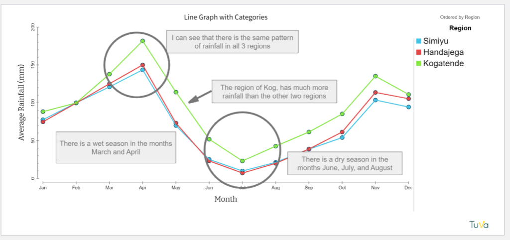
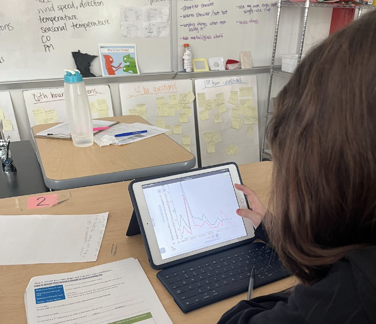
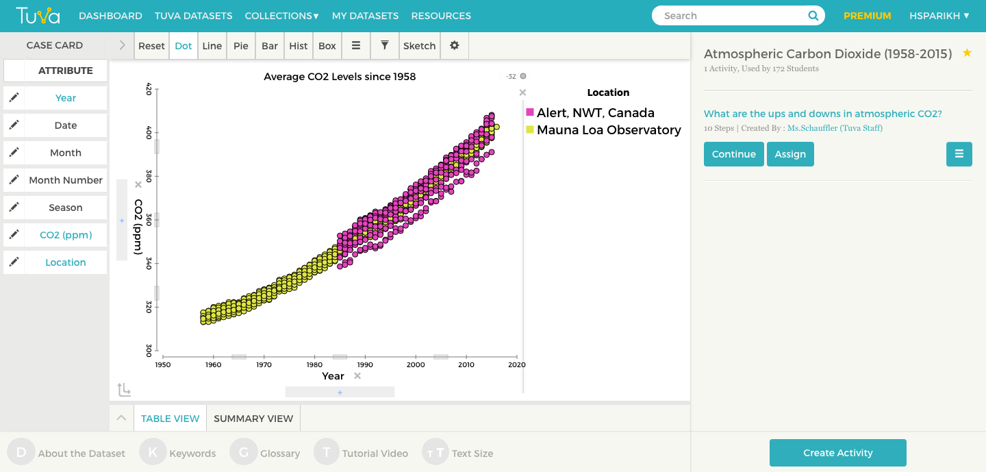
An example of student work from Lee’s class. Lee pulled data from OpenSciEd into Tuva.
Up to this point in their OpenSciEd unit, they’d primarily used line graphs to observe change over time. Now, they were struggling with the transition to scatter plots, getting confused about time versus relationship.
Lee uploaded the data onto Tuva and projected a scatter plot of rainfall vs. wildebeest occupancy on her interactive whiteboard. Then she had students come up and trace the dots from left to right and try to describe what their hand was doing- going up, going down, staying steady, or moving erratically. Some students were getting it, but many were not. Lee had them activate the least squares line.
Then, she said, “suddenly they could see it!” The line helped them ignore the background noise and identify the trend.
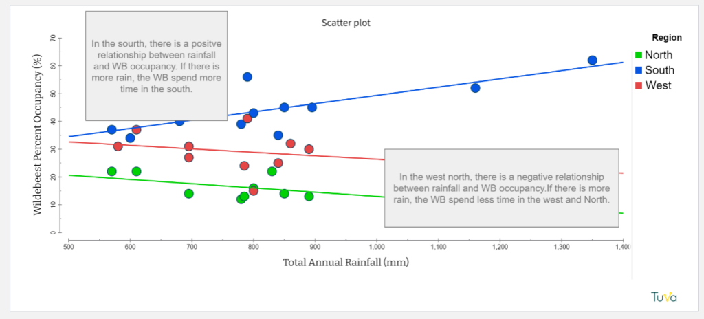
Another student work sample, this time with a scatter plot.
Student Ownership
Lee also said she appreciates the level of ownership Tuva gives students in the process of data exploration.
“Tuva puts students first in their interaction with data, so that they are driving their interaction and learning with the data and not getting it secondhand through a teacher filtering it for them.”
This level of independence is possible, she said, because Tuva leaves room for making mistakes and fixing them. With other tools, she’s needed to be more prescriptive because mistakes are harder to recover from.
Academic Communication: Scaffolding Up
Finally, Lee credits Tuva with creating more opportunities for extended learning. For example, when working with a class of multilingual learners, she found that Tuva’s interactive graphing tools accelerated the learning process enough that some students had time to deepen their interpretation.
Her class was working on the Tuva activity Dynamic Wildlife. (You can interact with the Wolf and Elk in Yellowston dataset the activity uses below!) She asked all students in the section to use the Identify and Interpret ( I2) method to discuss the wolf and elk population data. For example, a student might identify, “I see the line goes up at the start of the graph,” and interpret, “This means the number of wolves was increasing.”
Try dragging and dropping Elk Count (observed) onto the Y2 axis.
Many students completed this task quicker than they would have with print resources or spreadsheets. Lee capitalized on the newly-freed time to teach them to add quantitative measures, such as year and population count, to their evidence.
Lee noted that her class’s work with Tuva fits perfectly into the larger district goals, such as strengthening academic discourse and writing. Referring to Tuva as a “writing-science interface”, she said, “It’s the only tool I know that is really actively improving reading and writing skills for science. ”